Project: Site Design
Client: Kata Golda
Role: Art Direction + Design + Copywriting
This e-commerce site was created to announce Kata Golda’s new product line of over 400 products, and in conjuction with a print catalog containing the same content.
From initial concepting and schedule planning, to design and photography direction, to copywriting and proofreading — we worked as a lean and nimble team, moving fast between multiple channels, trading roles and holding each other to high standards. The annual NY Stationery Trade Show in NY, where we’d be debuting a new product line for the first time in 5 years, marked a firm and immovable finish line.
This project, in its massively overwhelming scale and complex orchestration of interlocking parts, is evidence of successful product management and dedicated work — and remains one of my proudest accomplishments.
Intentional Architecture
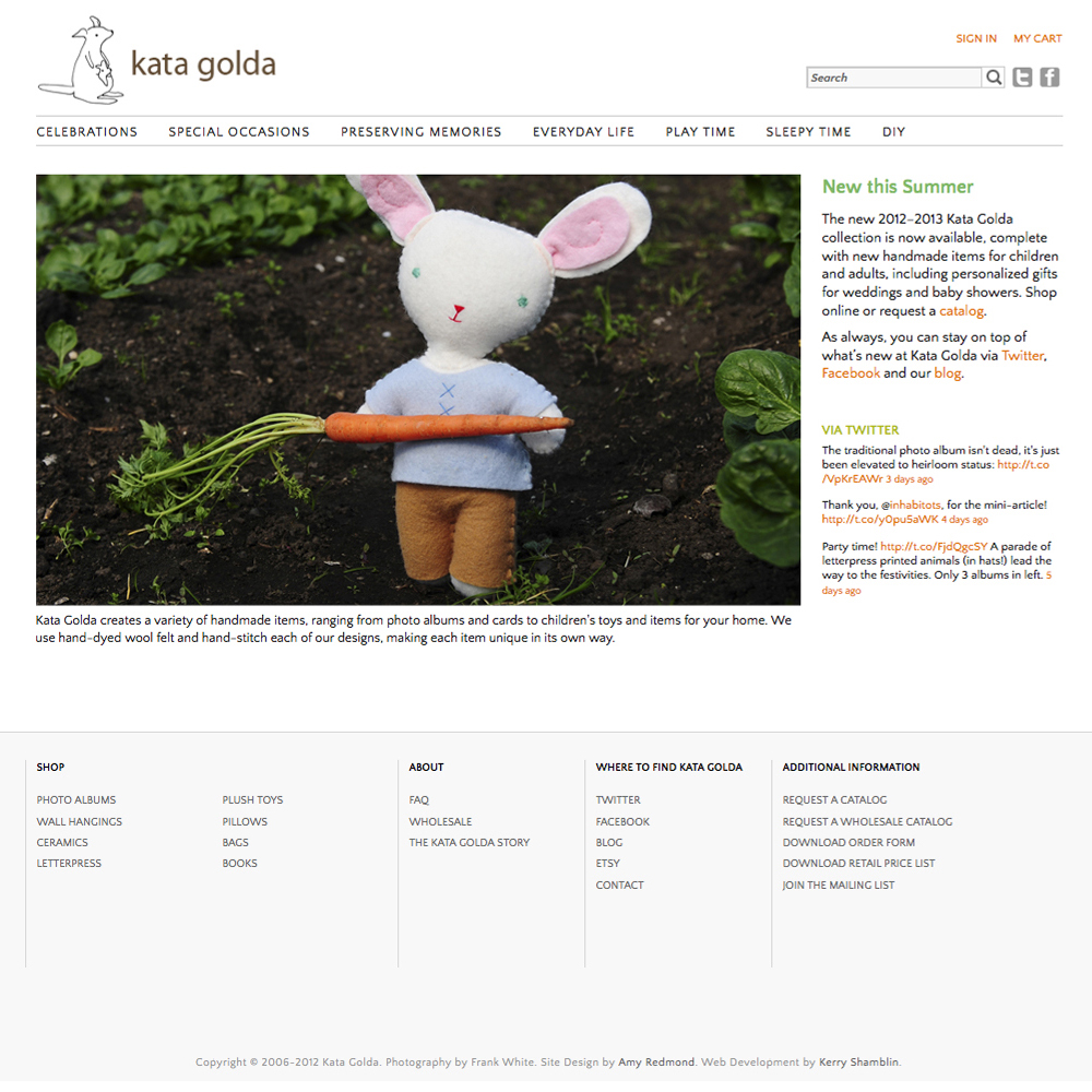
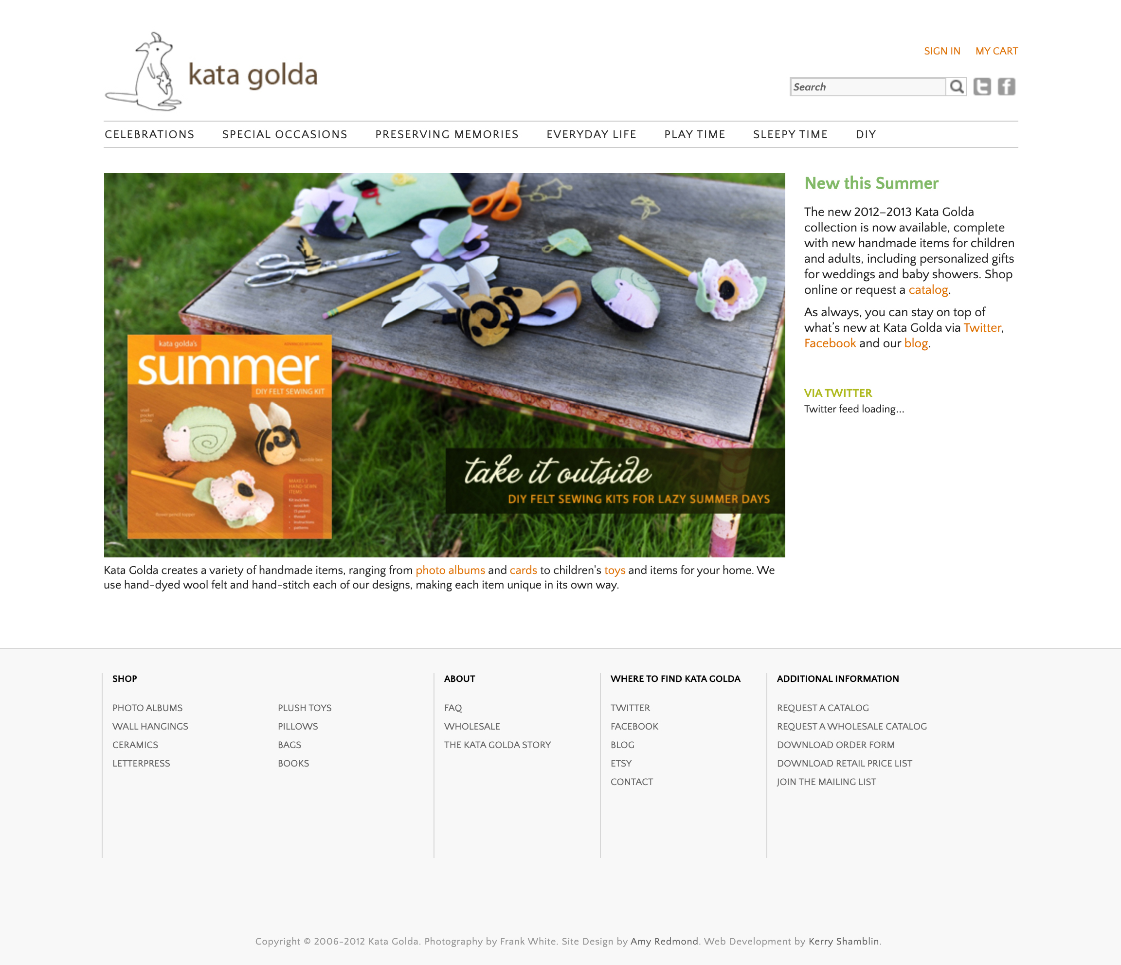
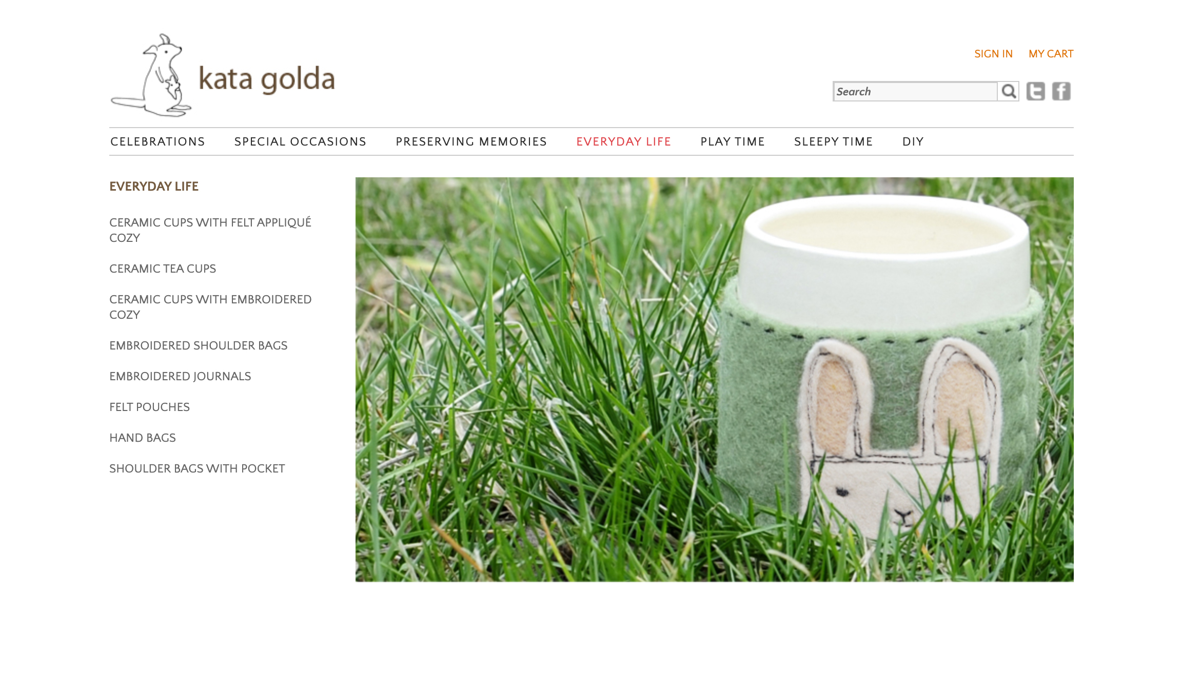
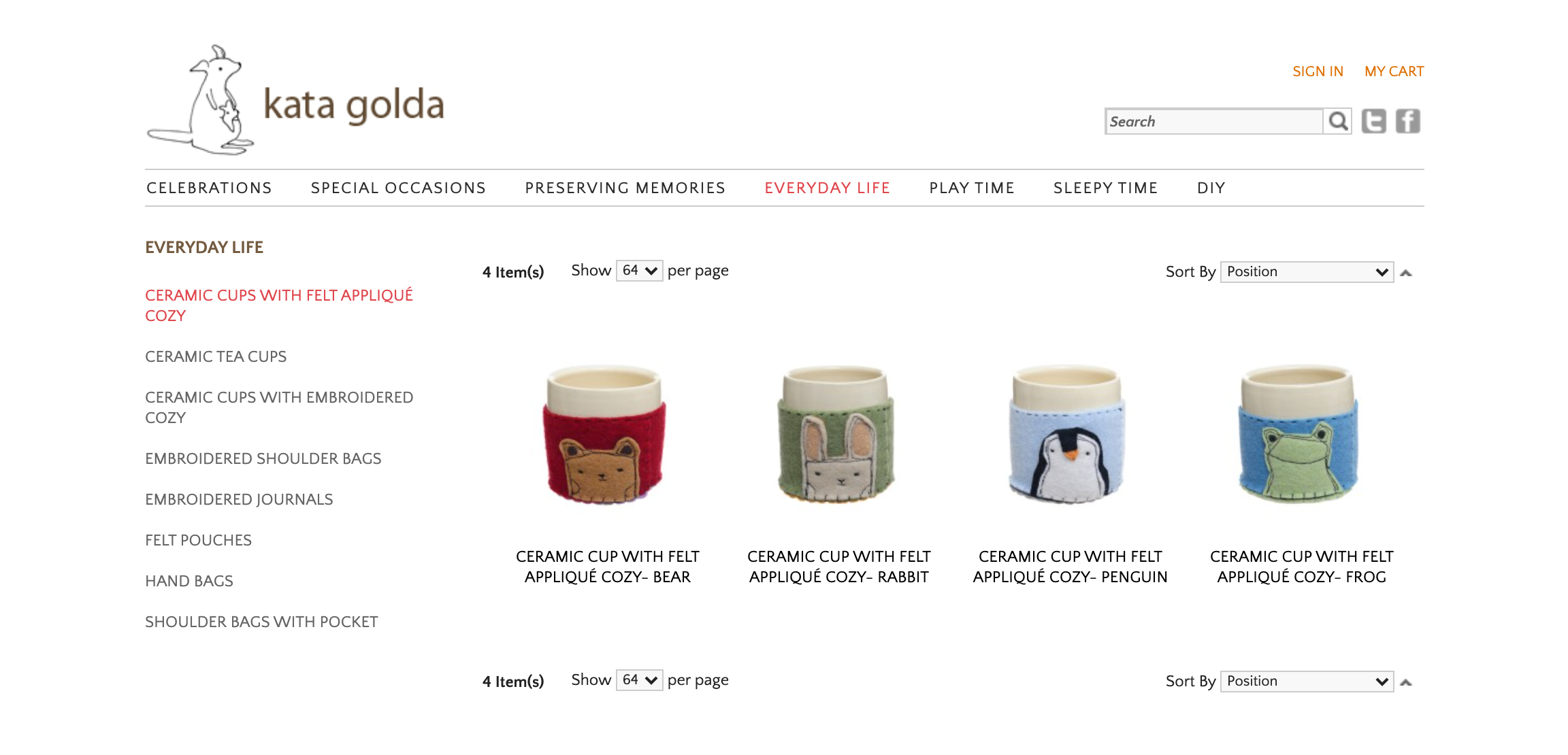
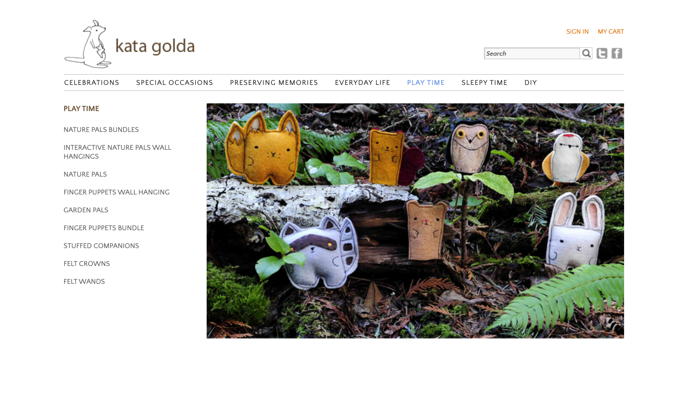
The site’s structure corresponded with the print catalog, both in organization and use of imagery. Grouping items in the main menu by activity category encouraged discovery (Everyday Life, Play Time), while each category sub-navigation revealed items by name.
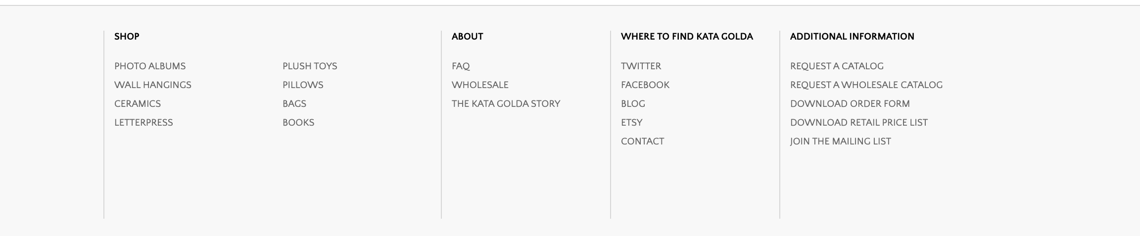
A persistent footer aided buyers by listing products by type (ceramics, books), and a search bar covered the rest of the ways buyers may seek an item.
Designing for Flexibility and Unity
The product pages showcased anywhere from 4–20 products, depending on the number of design patterns. To create visual unity across the site, I directed the product images to be photographed on white seamless backgrounds — reserving environmental shots for the home page, category pages, print catalog, and marketing collateral.
Dotting i’s and Crossing t’s
Switching my role to editor, I directed our small team of writers to be succinct and consistent in naming structure, so as to stay within character count limitations and to improve internal and external search results. Descriptions were just as closely monitored to include important details like color options, dimensions, and customization options.
Behind-the-Scenes: Crafting Organization Systems
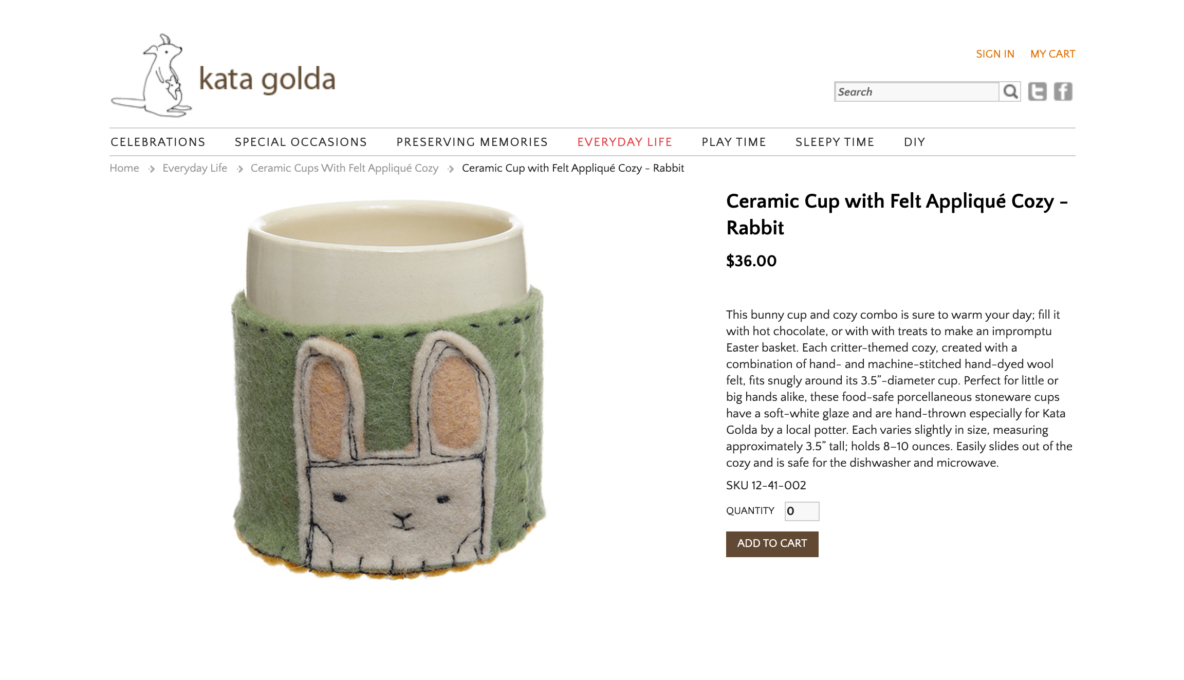
To assist with product organization I built an expandable SKU coding system, so that all products — and their image assets — could be easily identified by number.
For example, SKU 12-41-002 reveals these details:
- 12 = the year the product was designed
- 41 = the type of product (ceramic cup with felt appliqué cozy)
- 002 = the design pattern (rabbit)
Many of Kata Golda’s designs evolve over the years, but retain the same name. A teddy bear design for a photo album may look slightly different in 2014 than it did 2012, and it’s important to know when refilling an order for a wholesale client — or when searching for the correct image.
Designing the SKU system in this manner also allows it to grow and expand with the product line for years to come.
A Consistent End-to-End Customer Experience
Equally as important to the site were the forms buyers used to place orders and view pricing — not all buyers had converted to online purchasing, and many requested price lists for easy reference. It was critical these matched the site and print catalog experience, both in content and design.
The price list also afforded us the flexibility to adjust prices as needed without updating the print catalog, which did not include prices — this evergreen approach reduced our costs over time.
The final push for the site came in early 2012, as photography was finalized and content was populated on the site. This happened at the same time the DIY kit craft book series I designed were being packaged with their materials, and at the same time the print catalog was going to press. Once that moved into the bindery phase I was able to turn my attention to QA, assisting the developer with testing and bug-zapping.
We launched 2 weeks before the NY trade show, where we enjoyed accolades from long-time buyers and friends. The end result is a playful, uncluttered site that meets wholesale and retail needs, and had just as much love poured into at every stage as the handmade item Kata Golda makes.

CREDITS
Art Direction & Design: Amy Redmond
Photography: Frank White
Copywriting & Editing: Amy Redmond, Kate Dean, Alison Kaplan
Web Development: Kerry Shamblin
Experienced with working in agency and studio settings, Amy Redmond is an art director and visual designer who thrives on variety, creating print and interactive work for corporate and non-profit clients. To keep her creativity refreshed, Amy balances digital design with time in her letterpress studio (Amada Press) in Seattle. She teaches typography at the School of Visual Concepts and letterpress printing at Partners in Print, where she also serves as a founding member of PiP’s Leadership Team.