 Project: Logo for Big Lake Bar & Grill
Client: Big Lake Bar & Grill
Role: Designer + Art Director
ABOUT THE PROJECT
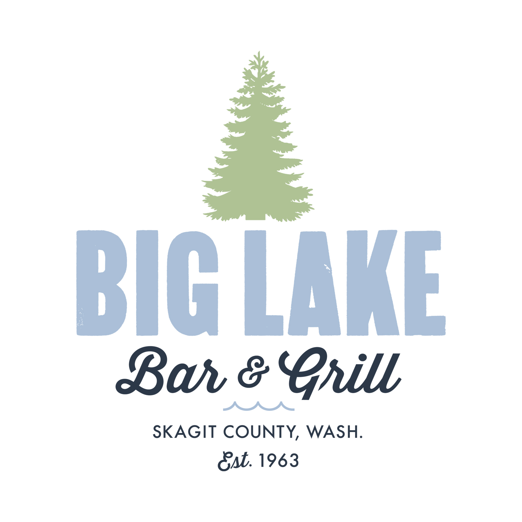
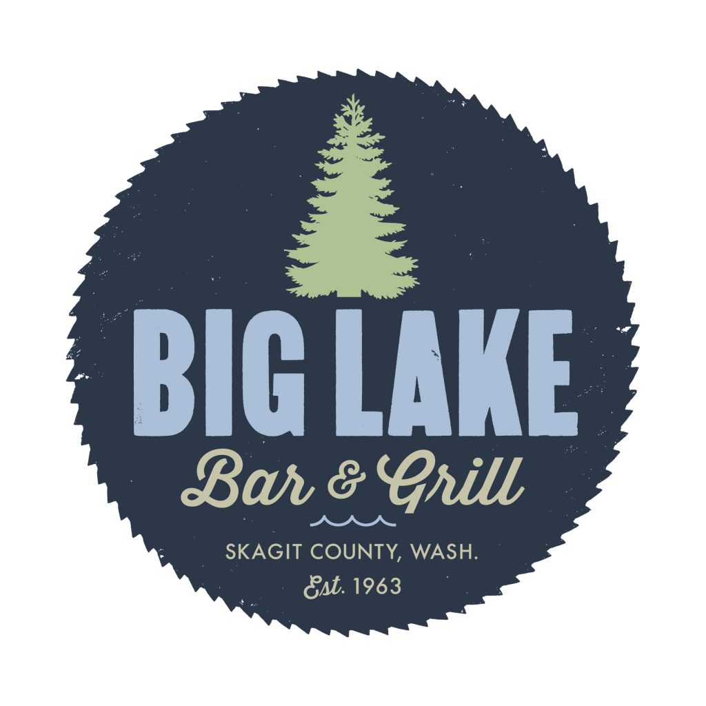
In early 2018 the new owners of Big Lake Bar & Grill began the process of renovating this beloved local hangout, starting with a new logo that reflects the area’s deep roots as a logging community.
Situated in what was once the town of Montborne (in the foothills of the Skagit River watershed near Mt. Vernon, Washington), this family-owned restaurant boasts views of Big Lake and enjoys warm afternoon sunlight. Starting in the late 1800s the Nelson Neal Lumber Company called Montborne home, with Day Lumber Company as its neighbor further down the road. The lumber and shingle mills are now gone, but generations of families take pride in this community and enjoy the outdoor recreation opportunities the area has to offer.
Big Lake’s history and environment all contributed to the logo concept, manifesting in the shapes of an old rusted saw blade, tree, and water. The type for “Big Lake” was created from hand-inked proofs I printed of wood type — type that was once part of the collection in nearby private letterpress shop.
DESIGNED FOR MULTIPLE USES
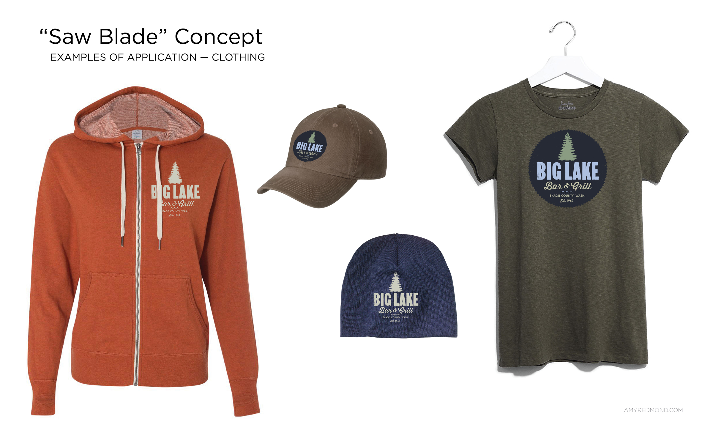
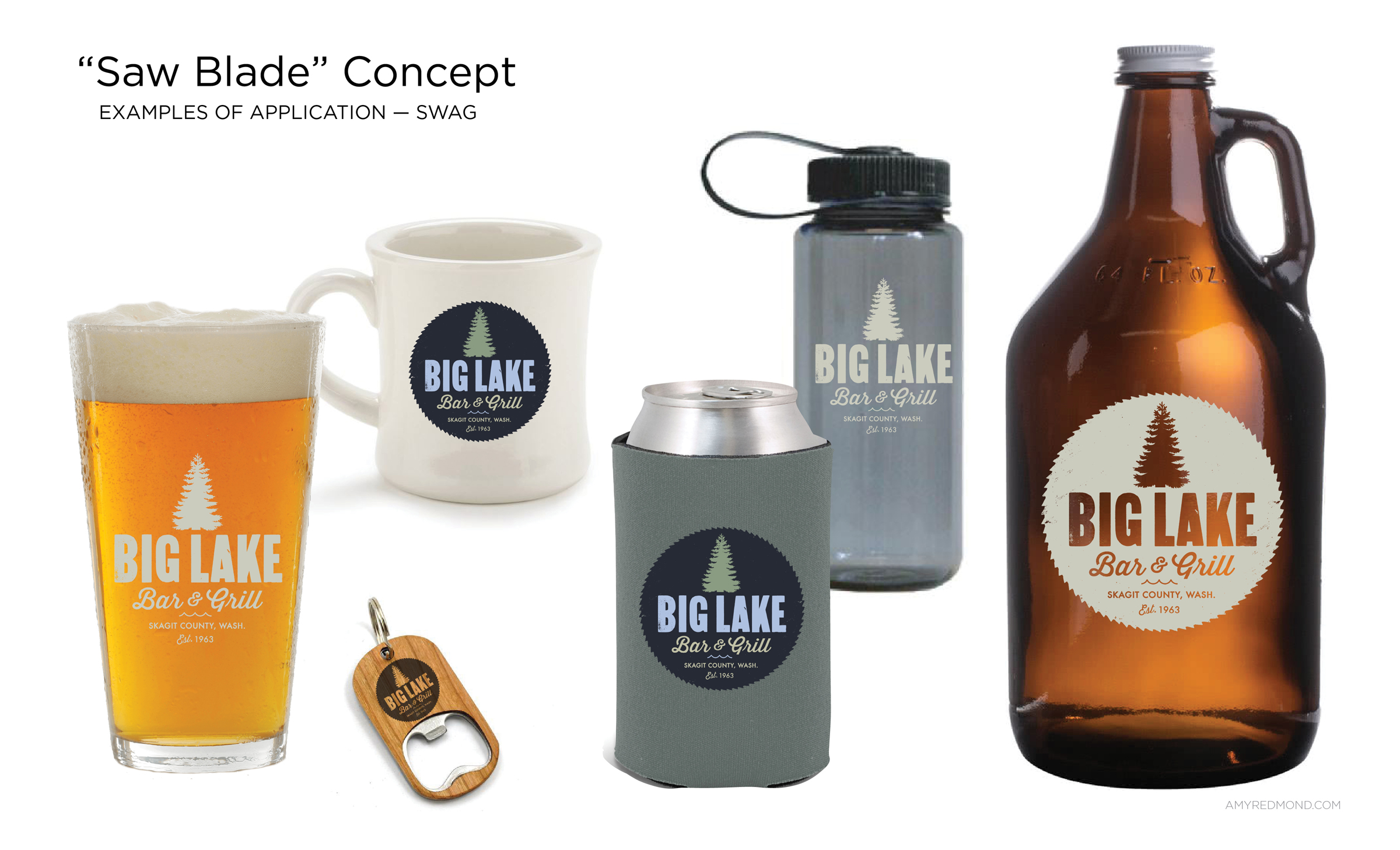
The client knew from the beginning he wanted an emblematic mark that easily lends itself to use on merchandise. Being able to show his — and his customers’— pride in being a Big Lake resident was important.
At each stage of the development process we tested the logo on t-shirts, hats, glasses and growlers so that we could evaluate how it would perform.
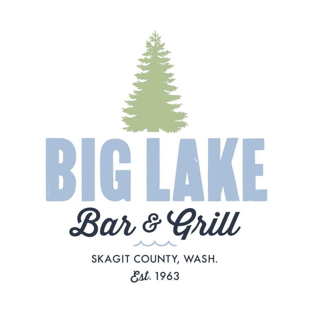
Through this exercise we realized that a secondary version of the logo, one without the saw blade, was needed for applications requiring simplicity.
DELIVERING A FULL LOGO SUITE
Once the final concept was approved, I shifted to building out the color variations needed for a full array of applications, from black & white to full color.
To help ensure quality control in how the logo is reproduced, I created a basic usage guide that shows all of the logo formats for print and web use — along with a list of their corresponding file names.
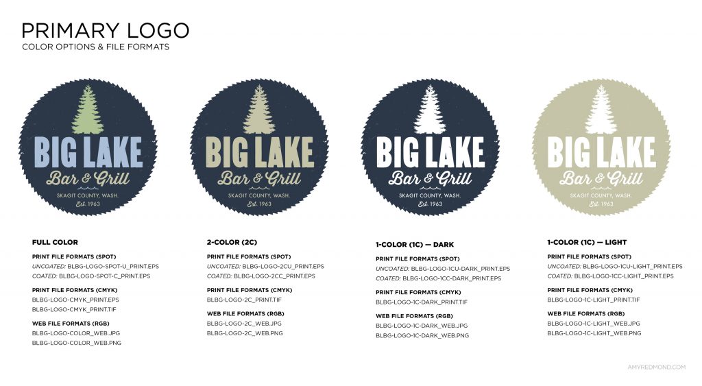
Details about the color breakdowns for each production process (RGB, hex, CMYK, & spot colors) were also provided.
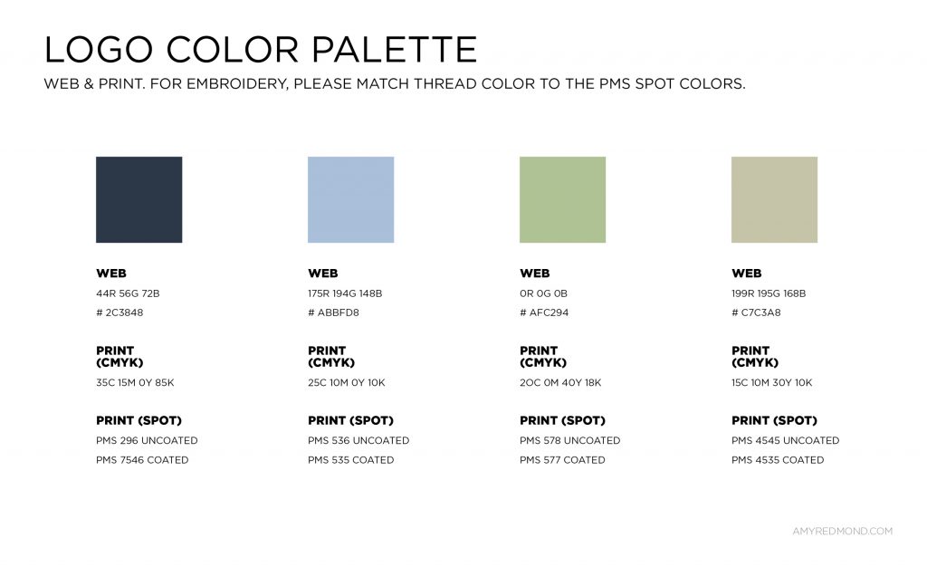
This allows my client to send vendors a single link to a folder containing the assets & usage guide, eliminating the need for the client to worry about which file format & ink specifications are right for the job.
WHAT’S NEXT
If you pass through Mt. Vernon, Washington, be sure to take a detour onto Route 9 and enjoy the view of the lake over a bite or pint — or perhaps some live music on the weekends. An insider tells me the menu is getting some new items (the pastrami sandwich is the bomb), and that Big Lake Bar & Grill t-shirts and beer cozies will be available soon.
Experienced with working in agency and studio settings, Amy Redmond is an art director and visual designer who thrives on variety, creating print and interactive work for corporate and non-profit clients. To keep her creativity refreshed, Amy balances digital design with time in her letterpress studio (Amada Press) in Seattle. She teaches typography at the School of Visual Concepts and letterpress printing at Partners in Print, where she also serves as a founding member of PiP’s Leadership Team.
