Third Place Books is an independent Seattle book store that invites national and local authors to give free public readings. Several times a year Third Place selects a book, typically a local author, for which I design and print a limited edition letterpress printed broadsides celebrating the launch of a book.
Details about the most recent print in this series, as well as a selection of prints spanning the past 13 years, are presented below. (Read more about the series.)
Deep River by Karl Marlantes
July 2019 (11 x 14 inches)
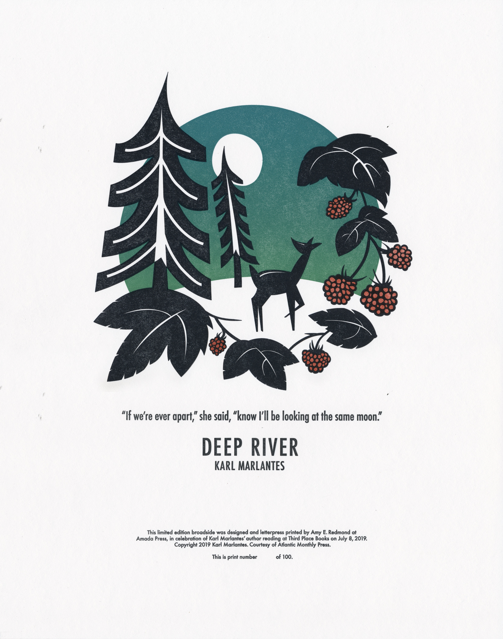
The newest edition to this series is a broadside for Karl Marlantes’ newest novel, Deep River, a “rich family saga about Finnish immigrants who settle and tame the Pacific Northwest, set against the early labor movements, World War I, and the upheaval of early twentieth-century America.”
This illustrated piece was inspired by Finnish folk art and the brilliant blue colors of the Pacific Northwest’s summer sunsets. It was designed and letterpress printed from photopolymer plates using a 1903 Colt’s Armory platen press by Amy E. Redmond.
Attendees of Karl’s Seattle reading and book signing on July 8, 2019 at Third Place Books’ Lake Forest Park store will receive a signed copy of this limited edition art print with each purchase of Deep River, published by Atlantic Monthly Press.
The Creative Process: Reading & Sketching
While the printing of the broadside only takes a day or 2, the process begins months in advance. I was given an advance copy of Deep River in February 2019, 5 months before the reading. Having long lead times allows me to read the novel at least one time, if not two. I look for passages that tug on a thread that weaves throughout the story, but also have context to the human experience outside of the book.
It wasn’t until page 500 that I had enough perspective to recognize such a passage. Deep River tells the story of a Finnish family’s migration and settlement in America, and true to its title this novel follows independent stories (streams) as they flow together to form a larger body of work. The scene is with Ilmari, one of the Finnish sons, and Vasutäti, an aging native American who lives in the same forest in southern Washington state.
Vasutäti motioned for Ilmari’s empty bowl. She set it aside, then held out both her hands to him. He hesitated, then joined their hands. She looked up and he followed her gaze to where the near-white moon danced with the branches of the firs and the scudding clouds. They watched it together for a time, then she squeezed his hands and looked in his eyes. “If we’re ever apart,” she said, “know I’ll be looking at the same moon.”
Her words resonated with me (I live far from my family) and with the experiences of the Finnish family being divided and united several times as they mature.
Two hundred pages later, in Part 5, there is a scene — once again with Ilmari — that alludes back to Vasutäti’s words and sharpened my vision for the broadside. It’s Summer Solstice in the Pacific Northwest, and Ilmari is gazing upon the moonrise as the sun sets. It’s this scene that inspired my illustration:
A full moon was rising in the sun’s afterglow, so only a few stars were visible.… A drowsiness had settled over the valley of Deep River. The salmonberries and thimbleberries pulled their vines to the earth. The air, too, was heavy, but like a comforting quilt — not at all oppressive, just warm and soft, pressing gently on Ilmari’s body. He heard a slight rustling. A young doe, probably fawned only the spring before, stepped daintily from the forest into the field. She stood there, her head raised, sampling the air. He chuckled. She had probably come for the vegetable garden. The doe looked directly at Ilmari, making him hold his breath. He felt his heart beat. She looked skyward. One of her ears twitched, as if trembling, but not with fear, with awe. She was looking at the rising moon. Ilmari joined the exquisite creature looking at the beauty — together, the two of them, in a sort of rapture. Then, the doe’s other ear twitched and she bounded into the forest.
This paragraph paints a striking scene: silhouetted vines, trees, and a young doe frame the foreground. Behind them sits a bright white full moon against a sky shifting from light to deep rich blues — saturated colors distinctly characteristic of our stunning Pacific Northwest skies just after the summer sun has set. The illustration style is inspired by traditional Finnish folk art.
With my design concept in place, I share my ideas with Third Place Books and the publisher to make sure the text hasn’t changed since the printing of the advance copy and the final edition and that the colophon (credits) are correct.
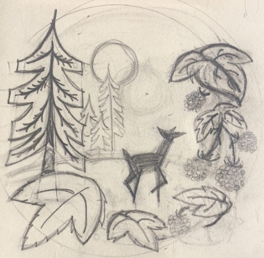
Once approved I move forward with sketches, then get approval on the final design before sending it off to Boxcar Press to have printing plates made and ordering paper. This Seattle edition of the broadside is printed on Flurry, Boxcar’s signature cotton paper. I also researched the color for salmonberries by walking through the woods and eating a few.
The Printing Process: One Sheet at a Time
Although this print appears to be just 3 colors (black, blue, and salmonberry red), it went through the press 4 times with some additional special treatment. Once alignment was achieved, the blue sky was printed with a split fountain (yellow on one end of the roller; blue on the opposite). As the rollers spin, the colors eventually blend together. It produces lovely tones, but care must be taken to uphold the variety in color. This is why each print is slightly different — just as the color of the sky becomes more unified as the sunset fades into night.
The second pass of the broadside through the press was the black part of the illustration. I printed this separate from the text so that I could better control the saturation of the ink. I found that double inking the plates, and then overprinting them 2–3 times gave me the saturation I desired on the thirsty cotton paper.
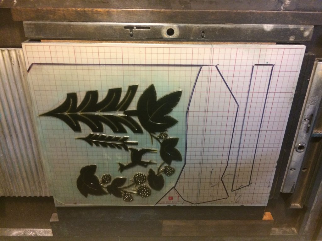
Had I printed the text at the same time, it would have been overinked and illegible. And so it was printed separately in the broadside’s third pass through the press, with less ink and only one impression. (In the photo above, the black outlines on the metal plate base show where the text plates will be placed.)
The fourth and final pass is the red ink of the berries, which was intentionally mixed to be transparent enough so that it wouldn’t be visible in the areas where it overprinted the black outline of the berries.
I used my 13×19” Colts Armory Platen Press to print this edition of 100 broadsides. Each sheet of cotton paper is hand-fed into the press one at a time, allowing me to check the accuracy and ink saturation of each print at every stage of the printing process. Misprints get set aside for use as future test sheets, and a few of those are given to the author to test pens before signing the final edition of 100.
This edition is unique to Karl Marlantes’ author reading on July 8, 2019 at Seattle’s Third Place Books in Lake Forest Park. It is only available with the purchase of Deep River, published by Atlantic Monthly Press (2019).
Border Songs by Jim Lynch
June 2009 (7 x 15 inches)
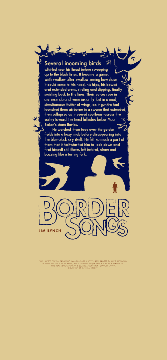
Printed in commemoration of author Jim Lynch and his June 2009 reading of Border Songs at Seattle’s Third Place Books. The design was created digitally and letterpress printed from photopolymer plates using a 1903 Colt’s Armory platen press.
The Three Incestuous Sisters by Audrey Niffenegger
October 2005 (7.25 x 18.25 inches)

Printed in commemoration of artist Audrey Niffenegger’s October 2005 visit to Third Place Books, in celebration of the commercial printing of her artist’s book The Three Incestuous Sisters.
The illustration and typography are Audrey’s, which I composed into this layout and letterpress printed from photopolymer plates on Magani Pescia paper using a Vandercook SP-15 press. The “red hair” is a piece of thread, which I sewed onto each of the 150 prints in the edition.
Blinding Light by Paul Theroux
2005 (11 x 15 inches)
Printed in commemoration of author Paul Theroux’s 2005 reading of Blinding Light at Seattle’s Third Place Books. The design was created digitally and letterpress printed from photopolymer plates using a Vandercook 4 press.
Sing Them Home by Stephanie Kallos
December 2008 (8.5 x 19 inches)
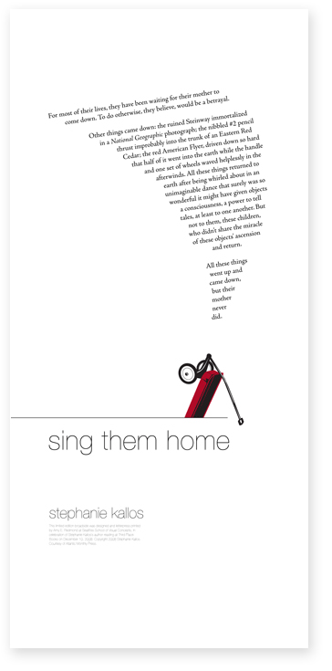
Printed in commemoration of Seattle author Stephanie Kallos and her December 2008 reading of Sing Them Home. The design was created on the computer and printed from photopolymer plates on Daniel Smith Lenox paper using a Vandercook SP-15 press.
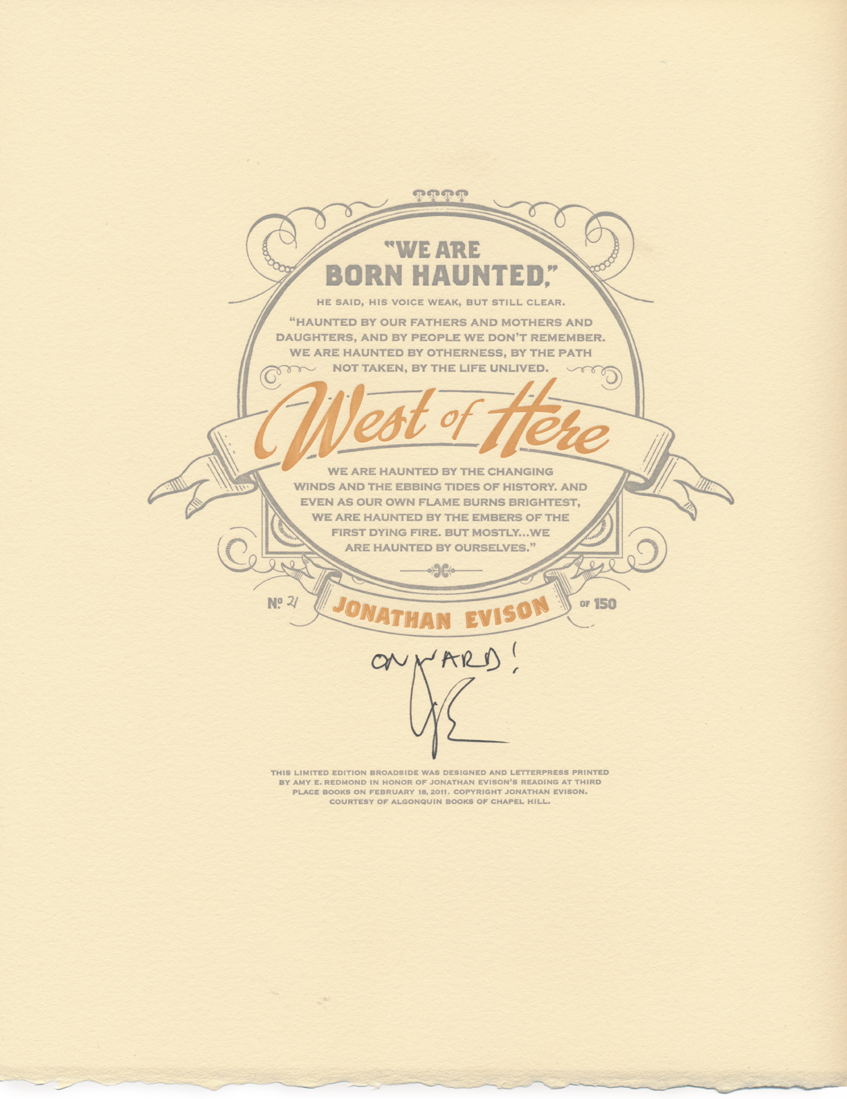
West of Here by Jonathan Evison
february 2011
Printed in commemoration of author Jonathan Evison’s 2005 reading of West of Here at Seattle’s Third Place Books. The design was created digitally and letterpress printed from photopolymer plates using a 1903 Colt’s Armory platen press.
Surveillance by Jonathan Raban
February 2007 (9.25 x 14.5 inches)

Printed in commemoration of author Jonathan Raban’s February 2007 reading of Surveillance. Inspired by letter forms and ornaments found in a letterpress shop, the design was created on the computer and letterpress printed from photopolymer plates on Daniel Smith Lenox paper using a Vandercook SP-15 press.
The Yiddish Policeman’s Union by Michael Chabon
May 2007 (11 x 15 inches)
Printed in commemoration of author Michael Chabon’s May 2007 reading of The Yiddish Policeman’s Union at Seattle’s Third Place Books. The design was created digitally and letterpress printed from photopolymer plates using a Vandercook SP-15 press.
So Brave, Young, and Handsome by Leif Enger
JULY 2008 (15 x 11 inches)

Printed in commemoration of author Leif Enger and his July 2008 reading of So Brave, Young, and Handsome at Seattle’s Third Place Books. The design was created digitally and printed from photopolymer plates using a Vandercook SP-15 press.
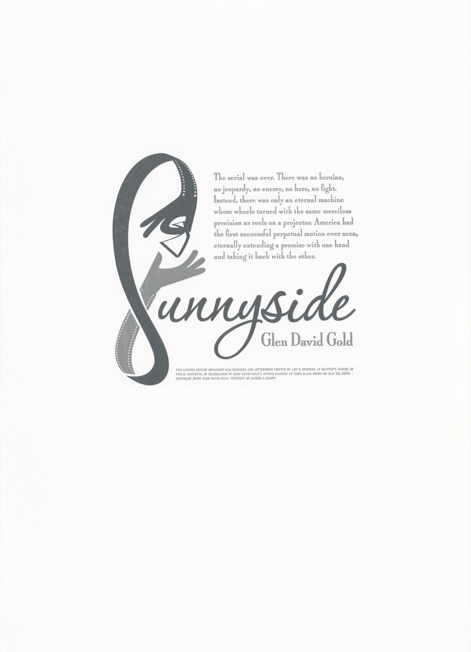
Sunnyside by Glen David Gold
May 2009 (10 x 14 inches)
Printed in commemoration of author Glen David Gold and his May 2009 reading of Sunnyside at Seattle’s Third Place Books. The design was created digitally and letterpress printed from photopolymer plates using a 1903 Colt’s Armory platen press.
Joe Sacco Author Reading
September 2006 (8 x 18 inches)
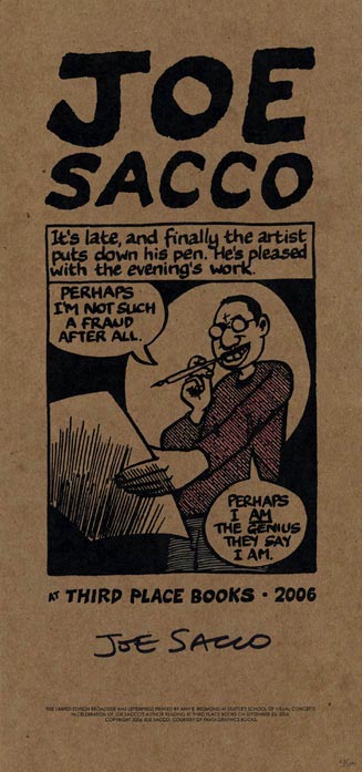
Printed in commemoration of Portland, Oregon author/artist Joe Sacco for his September 2006 reading at Seattle’s Third Place Books. The illustration and typography are Joe Sacco’s, letterpress printed from photopolymer plates on chipboard using a Vandercook SP-15 press. Color was added by hand, using watercolor paints.
Black Swan Green by David Mitchell
April 2006 (7 x 15 inches)

Printed in commemoration of author David Mitchell’s April 2006 reading of his book Black Swan Green at Seattle’s Third Place Books. The wood type letter forms in the word “Mine” were scanned from hand-inked proofs I took of wood type in the School of Visual Concept’s letterpress shop, which were then combined with images and text composed digitally. The final print was printed on Magnani Pescia (an Italian cotton paper) from photopolymer plates using a Vandercook SP-15 press.
Amada Press is the private letterpress studio of Seattle visual artist and designer Amy Redmond. The main focus of her work is on handset typography using metal and wood type. Amy offers letterpress classes for beginning and advanced students through Partners in Print and teaches typography at the School of Visual Concepts. Her professional design work can be viewed on AmyRedmond.com.
