 Project: Branding / Logo Design
Client: The Common Acre
Role: Art Director / Designer
ABOUT THE PROJECT
In early 2017 the founding director of The Common Acre and I embarked on the 9-month project of updating the non-profit’s logo. It had been through a few iterations over the years, and as a promising changes appeared on the horizon, it was finally time to commit to a proper brand refresh — one that allows TCA to put their best foot forward with a strong mark that represents their current vision and future growth.
SKETCHES & SEMI-TRUCKS
The executive director (Bob) and I worked through several brainstorming sessions, both together and independently, to uncover all the various aspects of The Common Acre: ecology, agriculture, art; urban and wild landscapes; community.
The organization overlaps several areas in its mission to bring people together, and has always had heart — but we were wary of using one as a symbol. It came and went as I iterated on ideas (so many pencil sketches!), but it struggled to take root.
Then one day, while driving back from Standing Rock, Bob had been stopped at a light behind a truck and found himself musing over its hazmat placards, and it sparked an idea.

What if we combined our previous discussions of the Fibonacci series and the Golden Ratio (commonly found in nature), with these shapes? Could I work with that?
Yes.
Many marks made it to the final rounds, and we used them as opportunities to explore color and texture.
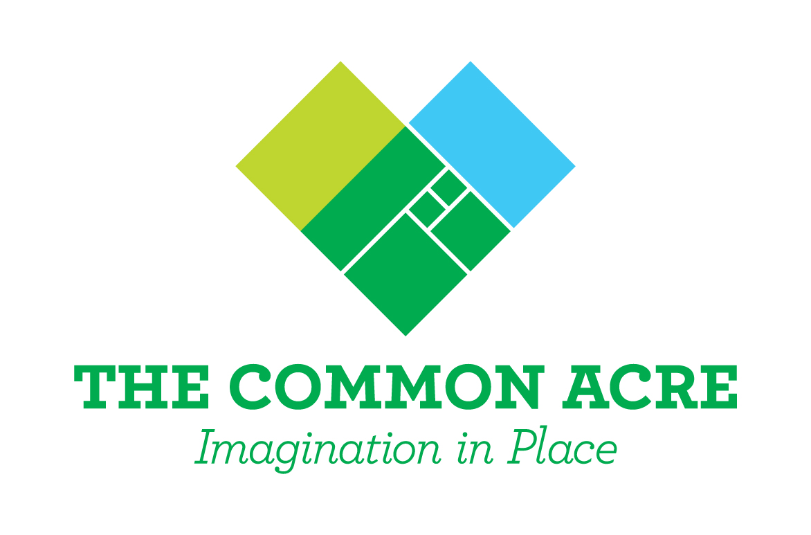
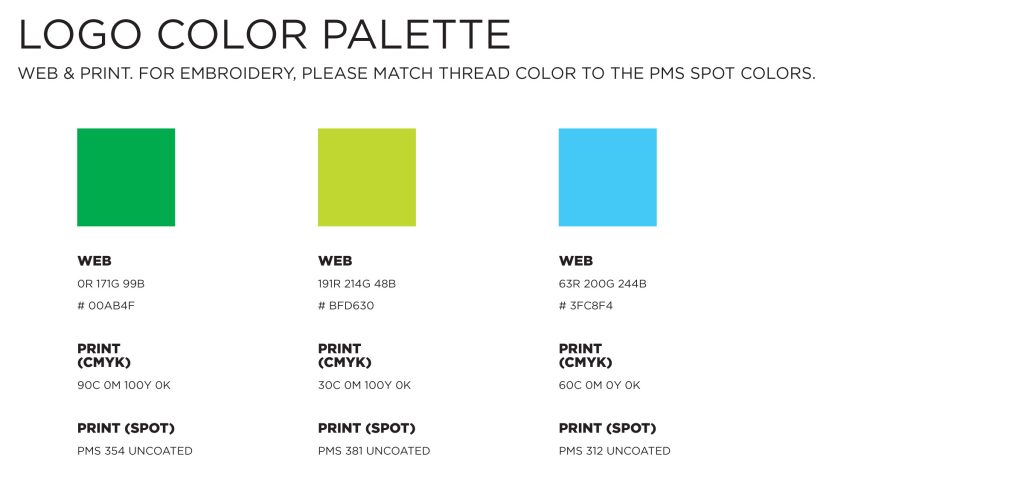
The winner was a combination of blue and green, that when overlapped makes a richer, saturated green. The colors represent water and land, and represent how TCA unites different groups in a common vision.
THE FINAL MARK
Through our partnership and commitment to the entire complete design process, we worked our way towards a solution that:
- expresses the multiple facets of The Common Acre,
- is rooted in science,
- expresses connection to the environment, and
- has a bold, emblematic presence.
Behind the Scenes: Interconnection
This logo was built using the Fibonacci Spiral, formed by an array of squares whose sizes are determined by the sum of the smaller squares preceding it (1+1=2, 1+2=3, 2+3=5, 3+5=8, etc).
The ratio of the arcs in the spiral that is formed is very close to the Golden Ratio, which is commonly found in nature, including plants (number & arrangement of flower petals, plant leaves, sunflower seeds); humans (the ratio between an arm & a hand, the spiral in the cochlea of the inner ear); & even plays a role in eye-pleasing proportions in art & architecture (rule of thirds in composition).
The sum of these parts make the Fibonacci series a very intriguing concept for TCA’s logo, uniting the natural world with the man-made world through a shared language.
![]()
IMAGINATION IN PLACE
The new tagline captures the spirit of the The Common Acre’s approach to community work, especially in the urban landscape where efficient use of green space requires creative thinking. It is a direct reference to Wendell Berry’s Imagination in Place, a collection of essays close that “serve as a reminder that a place indelibly marks its literature just as it determines its watershed community of plants and animals.” We had our doubts we’d be able to use the title as our tagline, and were delighted when Mr. Berry gave us his permission.
![]()
DESIGNED FOR MULTIPLE USES
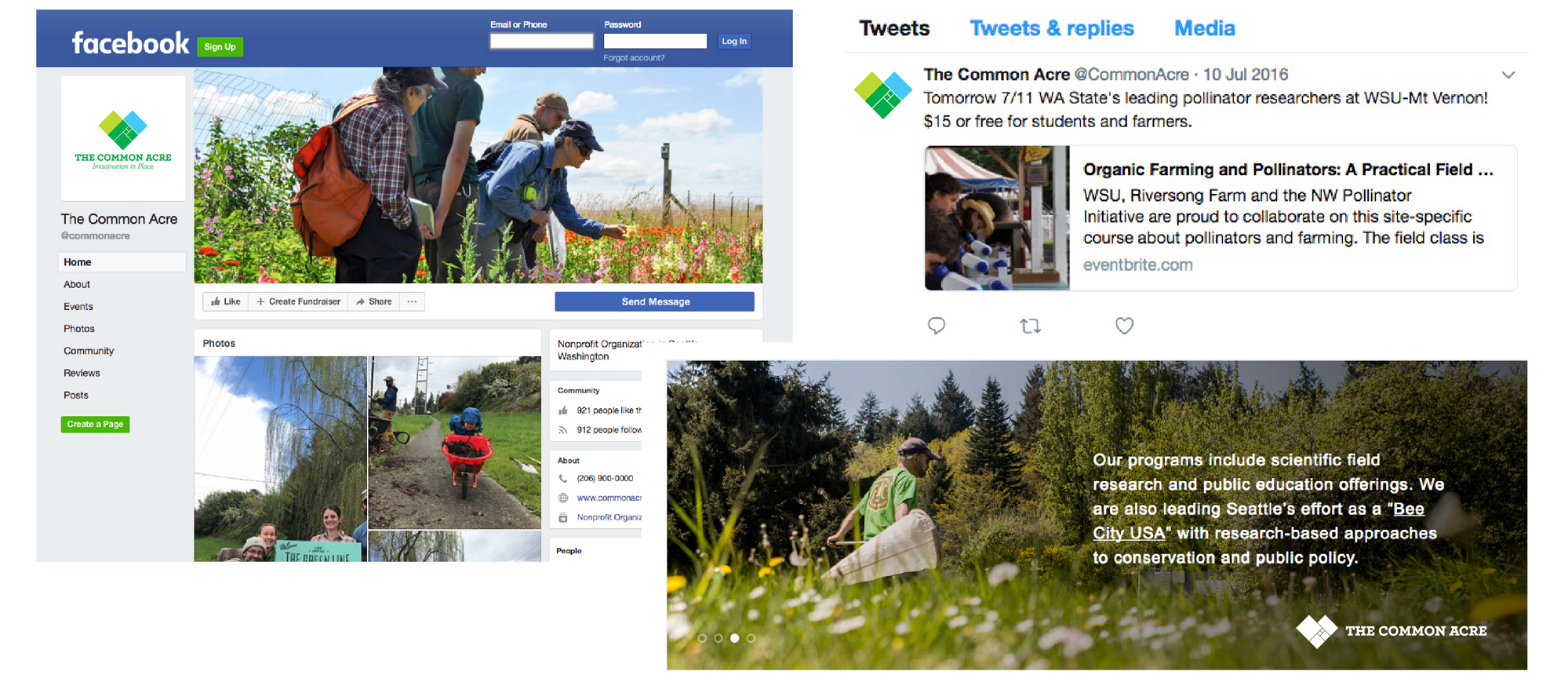
We knew the logo would live in both print & digital spaces, and designed 1-color and 4-color solutions to make sure the organization was always able to ensure brand cohesion in a variety of channels, affordably.
We even animated a version, for use in video channels. It illustrates how the logo spirals out from a single shape, multiplies, & becomes greater than the sum of its parts.
![]()
DELIVERING A FULL LOGO SUITE
Once the final concept was approved, I shifted to building out the color variations needed for a full array of applications, from black & white to full color.
To help ensure quality control in how the logo is reproduced, I created a basic usage guide that shows all of the logo formats for print and web use — along with a list of their corresponding file formats.
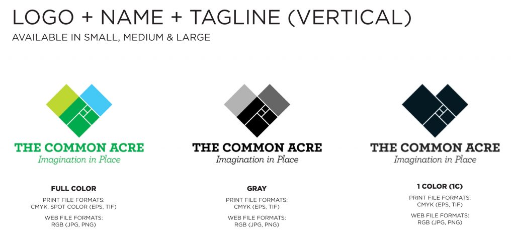
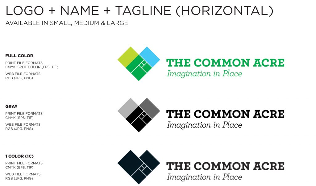
Details about the color breakdowns for each production process (RGB, hex, CMYK, & spot colors) were also provided.
This allows my client to send vendors a single link to a folder containing the assets & usage guide, eliminating the need for the client to worry about which file format & ink specifications are right for the job.
With over 18 years of experience in agency and studio settings, Amy Redmond is a visual designer who thrives on variety, creating print and interactive work for corporate and non-profit clients. To keep her creativity refreshed, Amy balances digital design with time in her letterpress studio (Amada Press) in Seattle. She also teaches at the School of Visual Concepts.