Project: Business Letterhead, Coasters
Client: Letterpress Distilling
Role: Art Direction / Design / Letterpress Printing
Most of the work I do comes my way by word of mouth, which I like. It means that my clients are coming to me because my design work resonates with them, and it also means that we most likely have friends in common — meaning that we’ll get along fabulously. So right from the gate, two big hurdles have been cleared.
This was exactly the case with Letterpress Distilling. A few pals from my days at WongDoody recommended that Skip, the owner of the new Seattle-based distillery, get in touch with me about designing letterpress printed business cards. The project sounded interesting (A distillery? I’m in!), but I have to admit that I was a bit skeptical about the choice of business name. As someone that’s been doing letterpress printing since before it was “cool”, I was concerned that this was someone just trying to capitalize on the widespread popularity of letterpress.
So we met, over coffee, as is the Pacific Northwest way of doing business. And I asked the hard question about the name choice: Why Letterpress? As it turns out, he had a good answer. He’d been bitten by the letterpress bug way back when, and having done his own printing, fell in love with hand setting metal type — and all the time and patience that goes along with it. It was exactly the sort of dedication to craft that he wanted his distillery to embody.
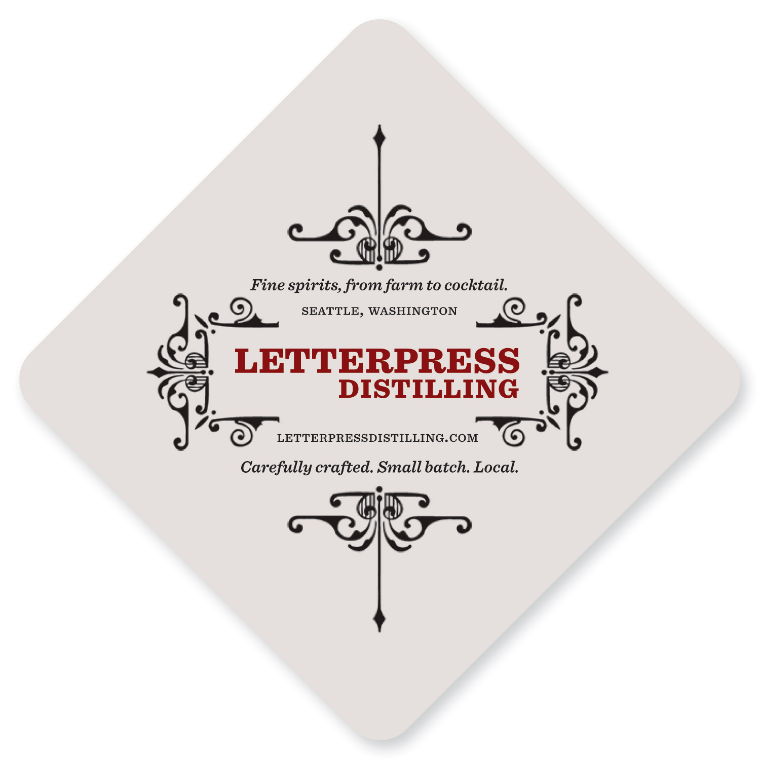
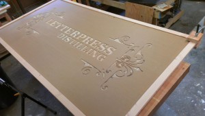
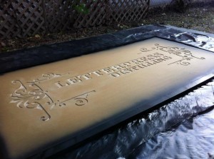
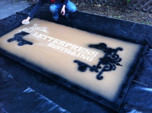
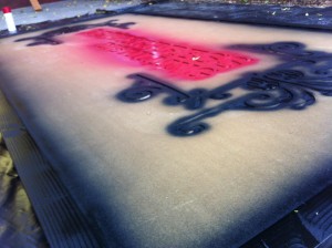
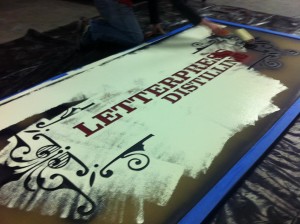
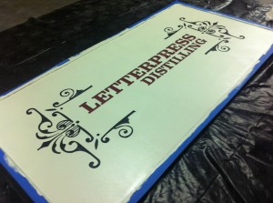
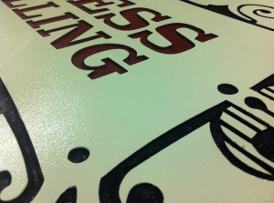
Understanding exactly what he meant by the pleasure in patient craft, I immediately jumped into the fun task of researching decorative icons and type, and then turned to designing the business cards and coasters. While inspired by the metal type and ornamentation of traditional letterpress, the design was composed digitally and printed from photopolymer plates. It was clear we would print the coasters on heavy coaster stock, but what about the business cards?
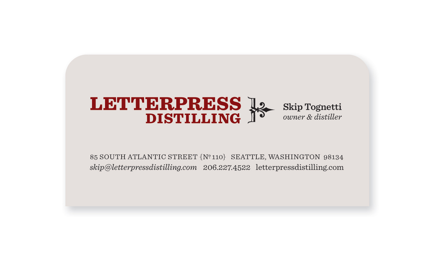
Turns out they worked great on coaster stock too — just cut the coaster in half, and off you go. You’ve got a place to rest your shot glass, and the number of the guy that can refill it for you.
The type treatment on both of these pieces was so well received that it became adopted as the logo: first for the distillery’s signage and barware, then later — with modification — for the bottle labels.
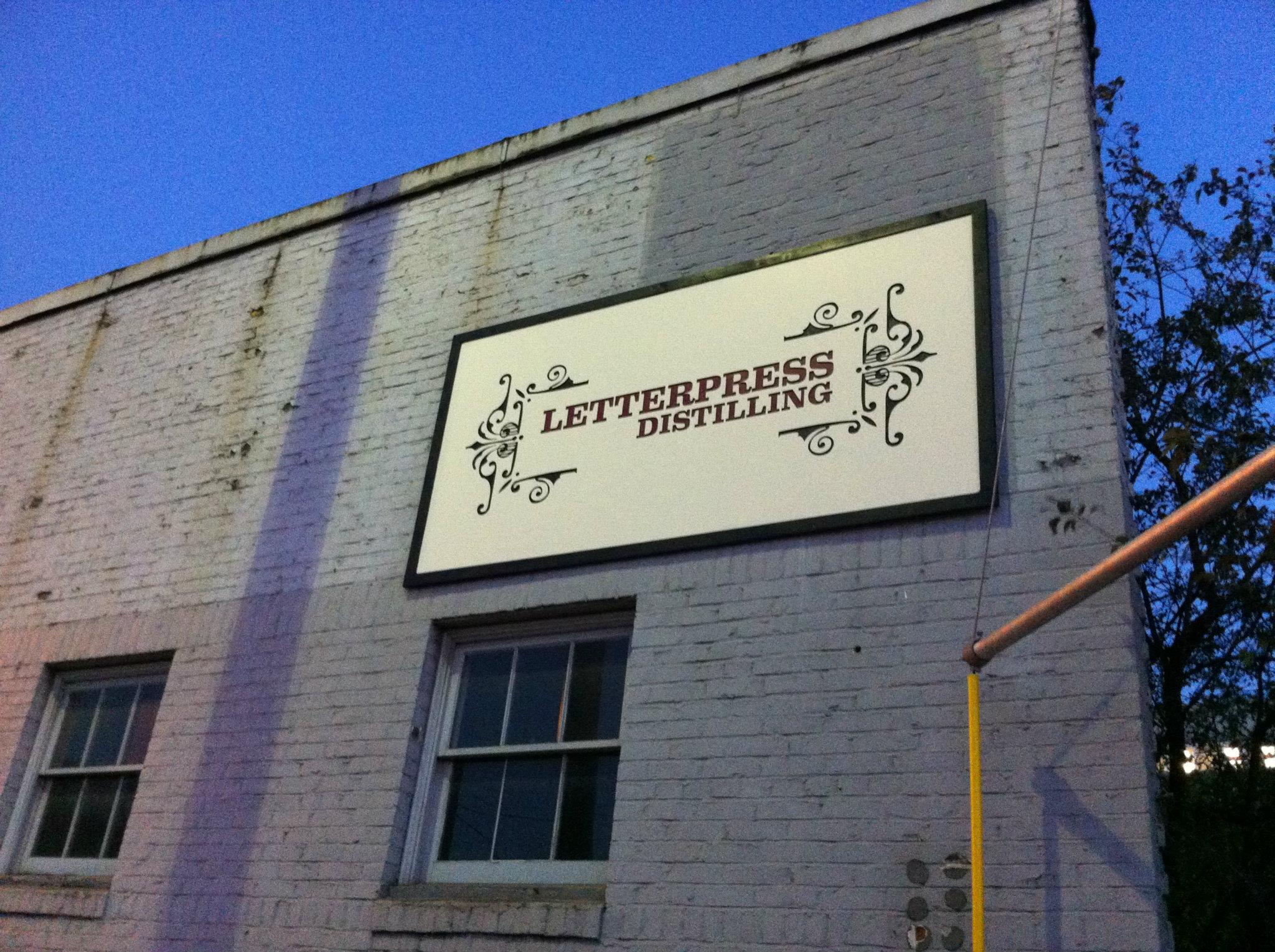
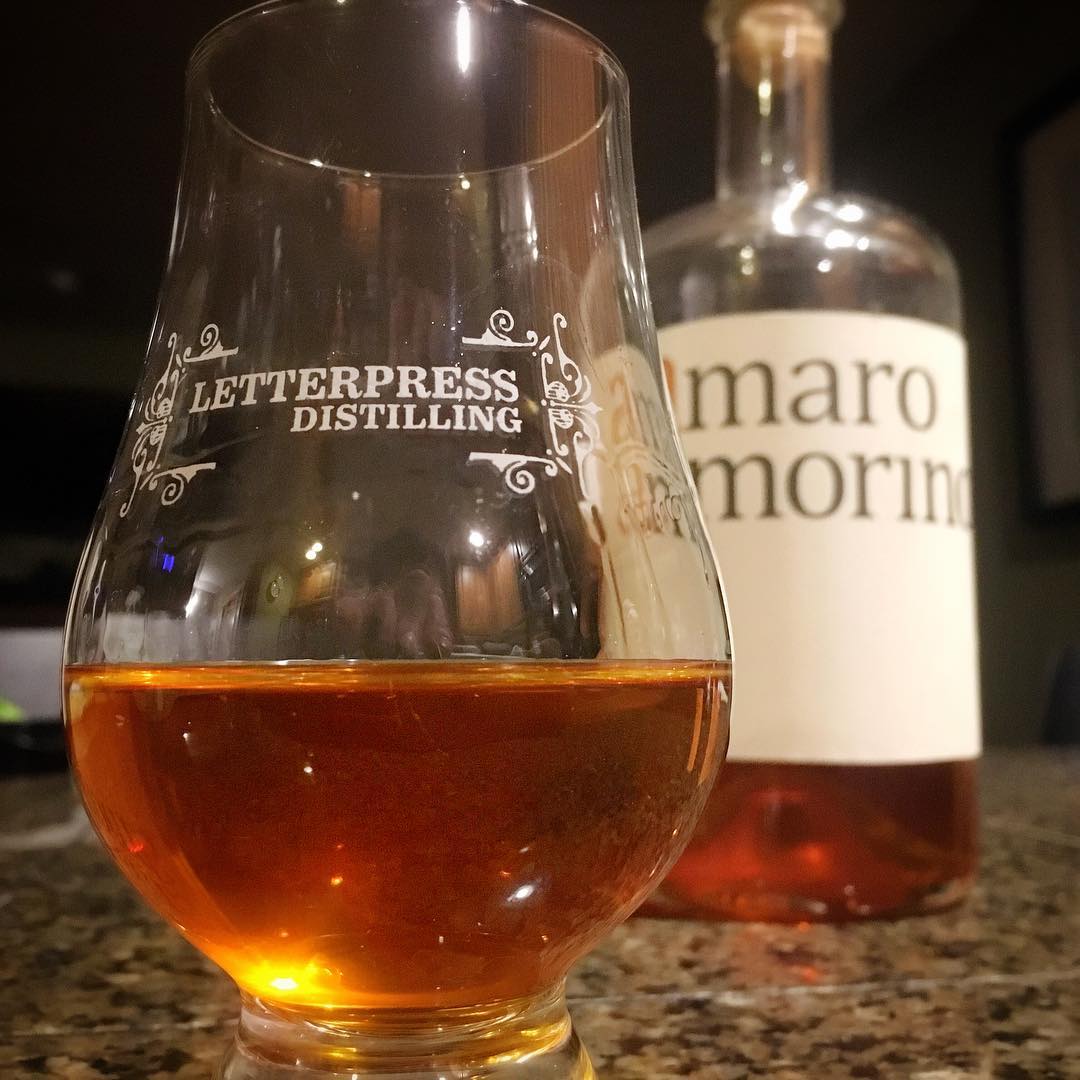
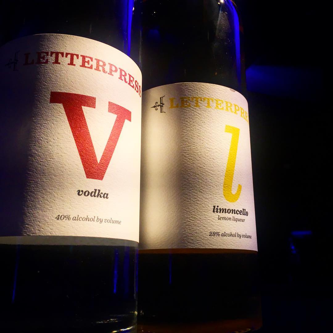
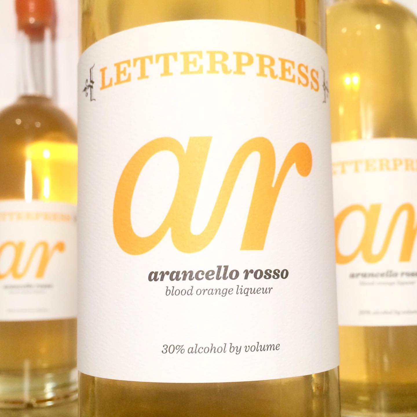
Barware & bottle photos courtesy of Skip Tognetti, Letterpress Distilling. {Saluti!}
With over 2 decades of experience in agency and studio settings, Amy Redmond is a visual designer who thrives on variety, creating print and interactive work for corporate and non-profit clients. To keep her creativity refreshed, Amy balances digital design with time in her letterpress studio (Amada Press) in Seattle. She also teaches at the School of Visual Concepts.