Project: This Week in Books (Responsive web site)
Client: Amazon Publishing
Role: Senior Visual/UI Designer
This Week in Books was already in the works when Amazon Charts made its debut as a competitor to the New York Times Best Seller list in 2017. Created as a companion to Charts’ highly robust data analysis of most read and most sold books, this weekly publication tells the backstory behind the fiction and non-fiction books that make their way onto the list.
The focus on the reading experience, not conversion to dollars, was the focus of our design team. As avid readers, we structured This Week in Books to invite moments of focus and calm into the digital reading experience, which often suffers from its tendency to cram content into as tight of a space as possible.
Although it appears to be a simple web page, the construction of the site was built to handle variety and complexity as the content grows more robust. On the smallest screens, it functions as an easily scrollable, 1-column layout. On tablets it begins to open up, becoming more dynamic as elements make smart use of margin space. At its peak is the desktop view, where readers using their laptops enjoy the aesthetic calm and focus of ample white space (and noticeable lack of advertising).
[Below, L-R: Mobile, tablet, & desktop breakpoints.]
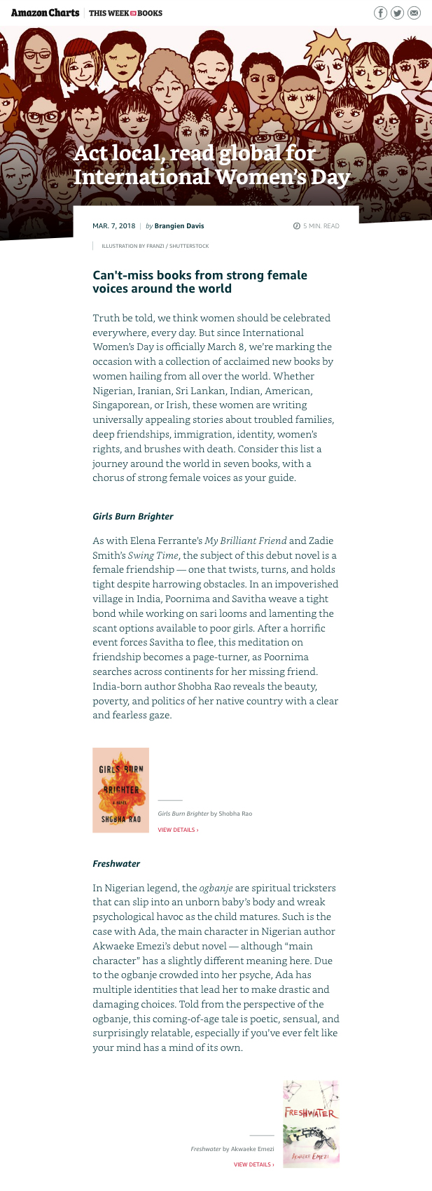
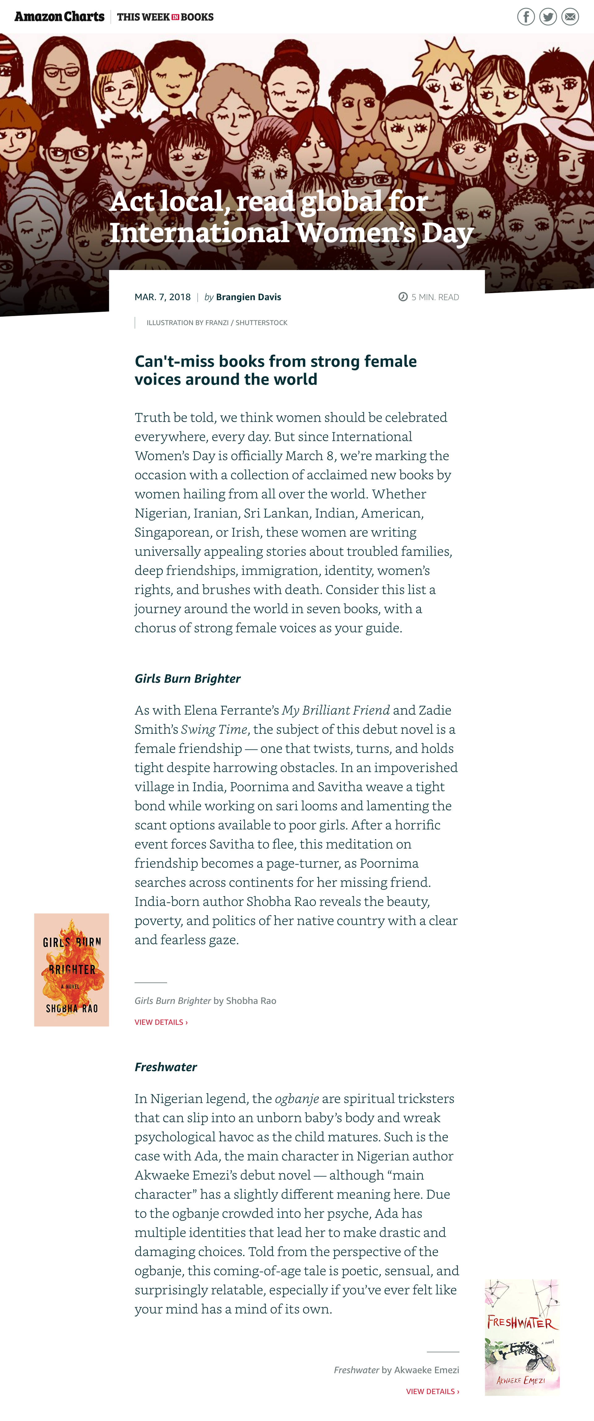
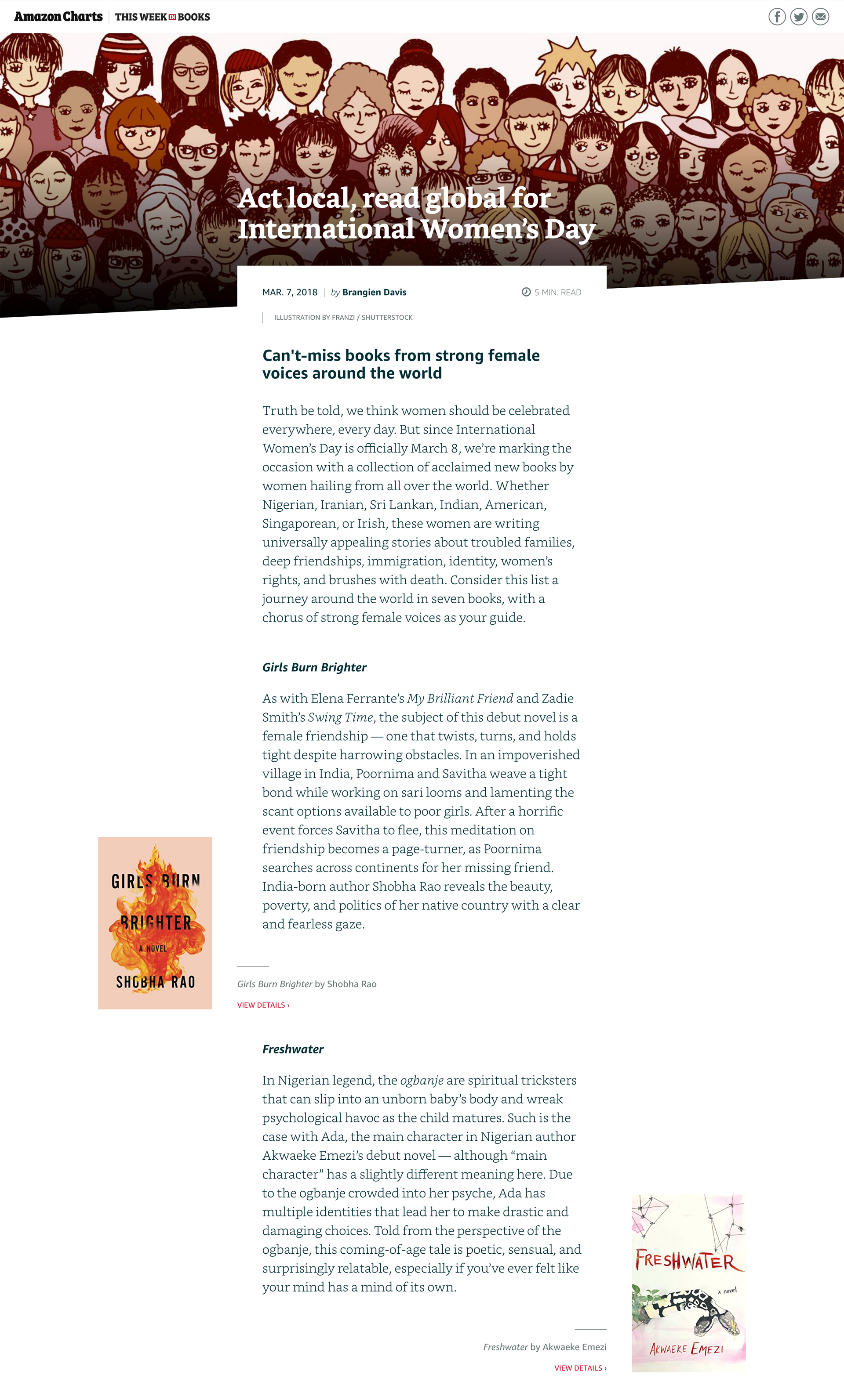
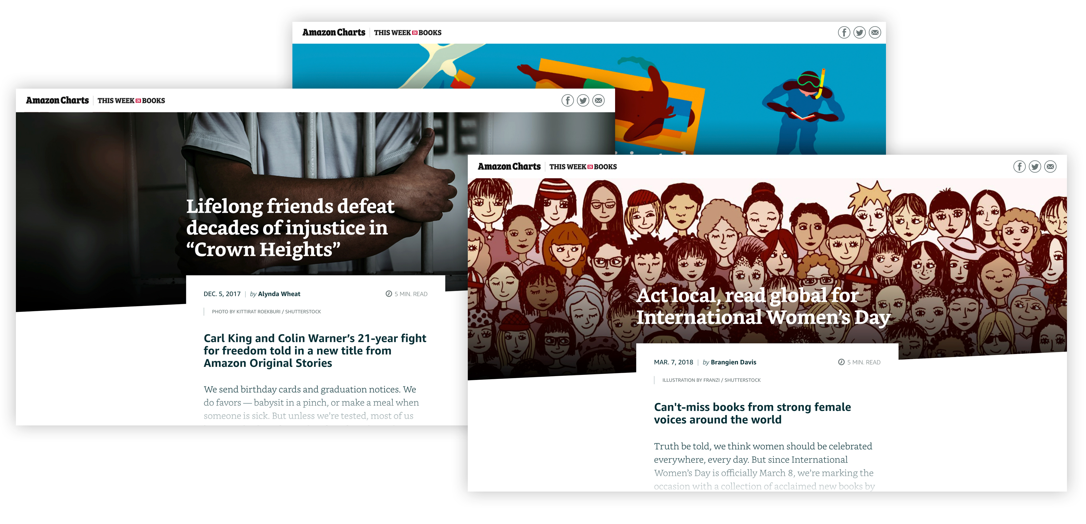
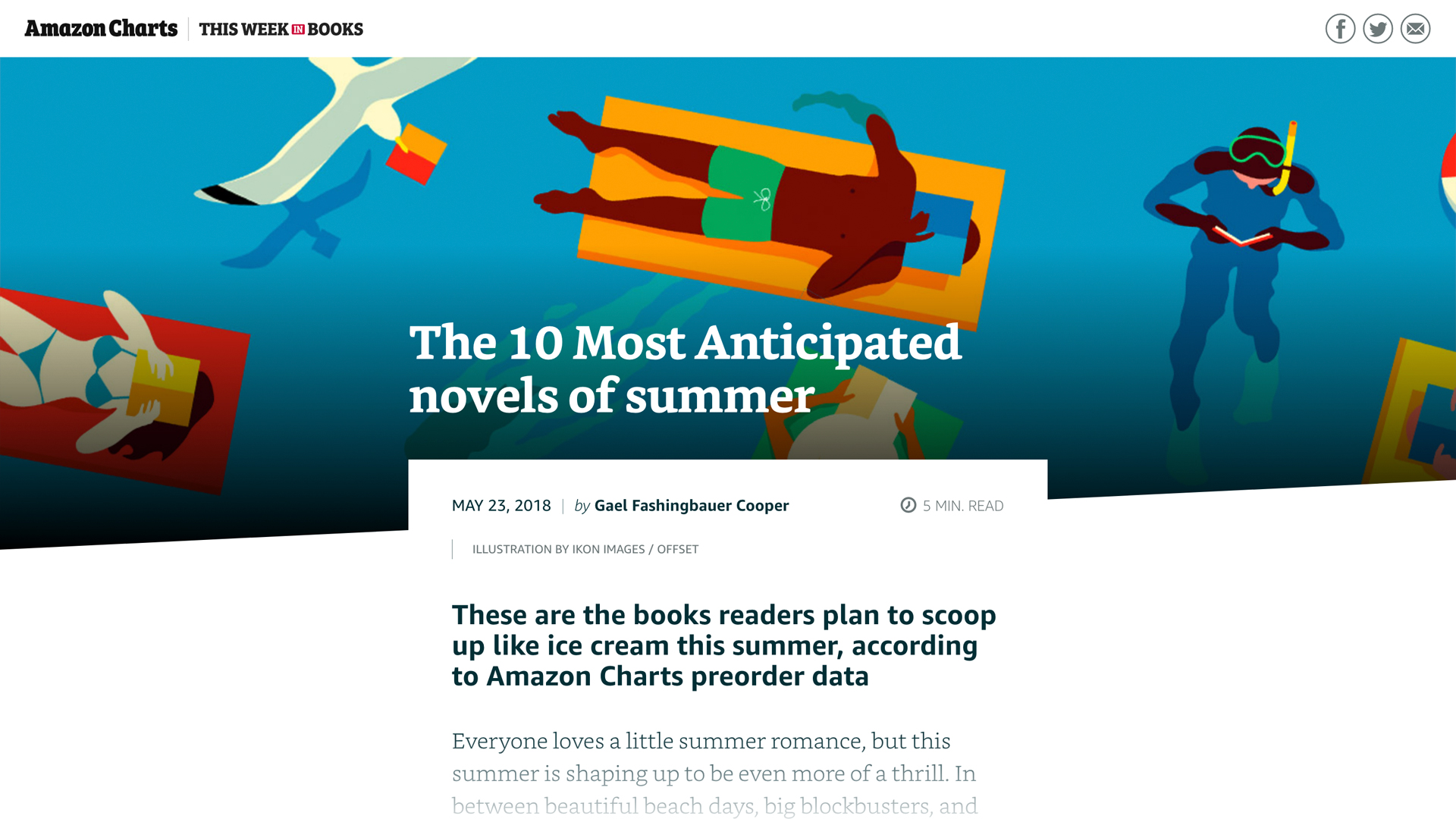
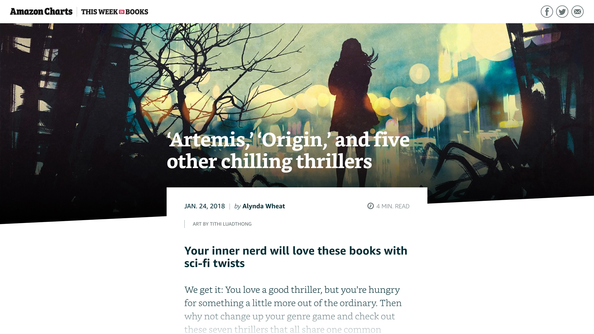
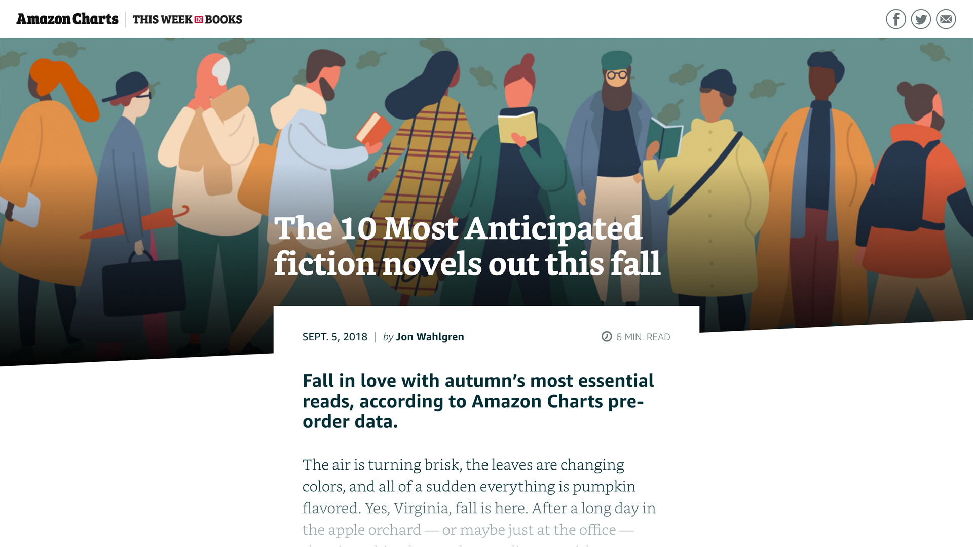
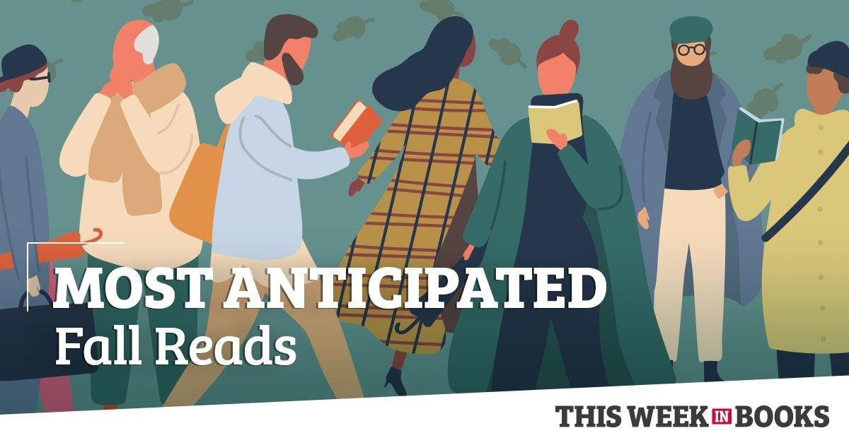
Care was also taken to avoid the “speed bump” experience of screen reading: text, image, text, image, text, image. Book covers alternate from the left to the right side as the reader scrolls down the page, drawing the eye in a fluid motion through the content. That same diagonal motion of the eye is mirrored in the angled shape of the hero image (at the top of the page), and again in the background tone blocks at the bottom of the page.
[Below, L-R: Mobile, tablet, & desktop breakpoints.]
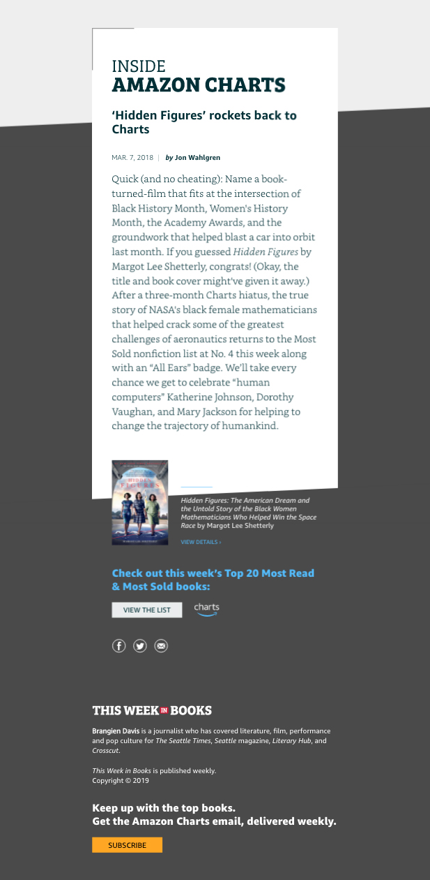
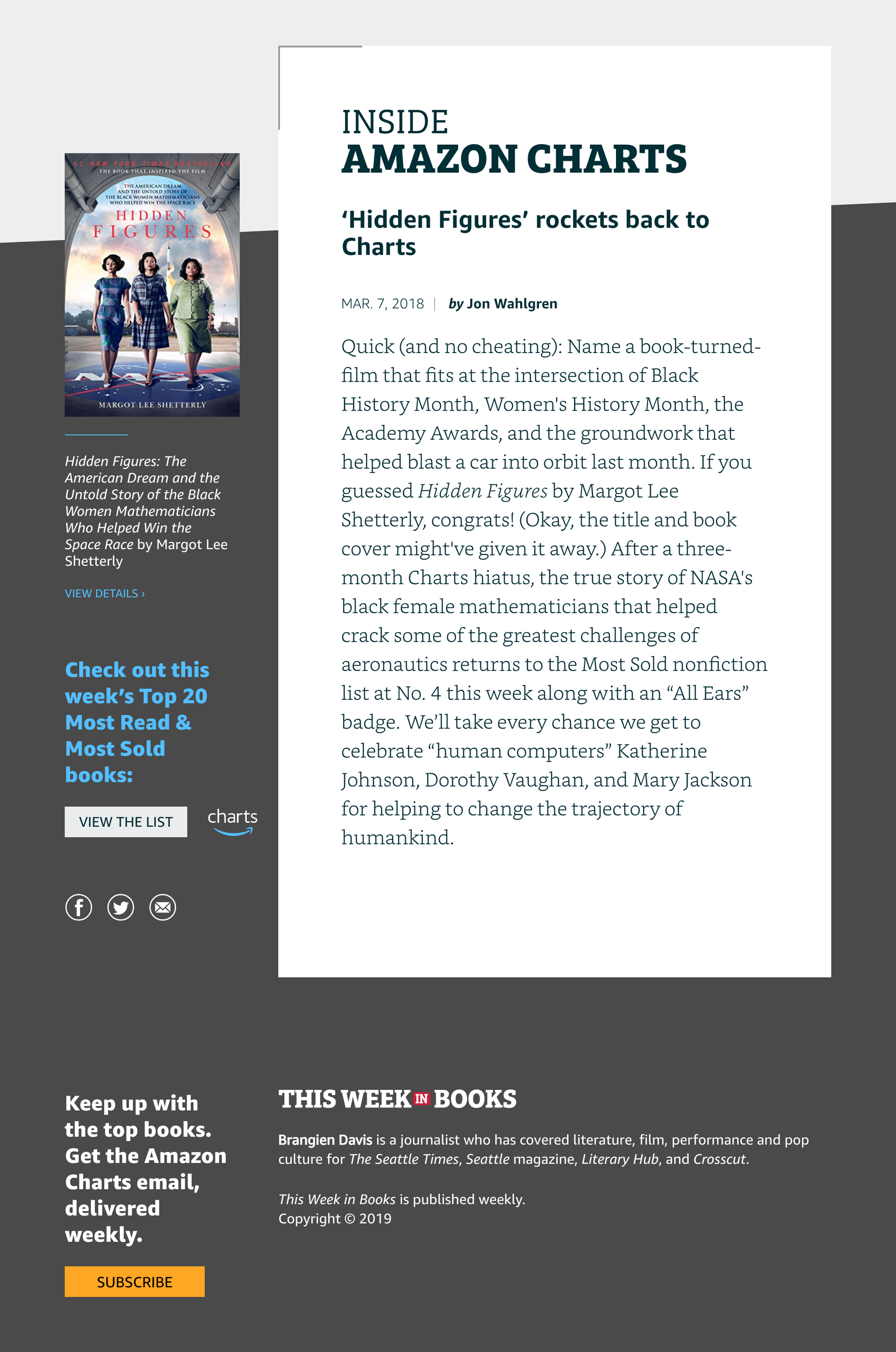
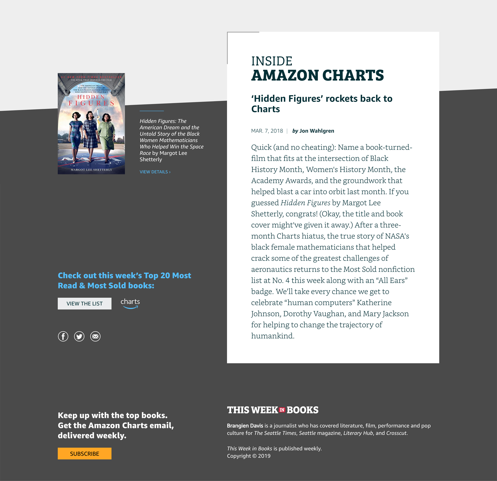
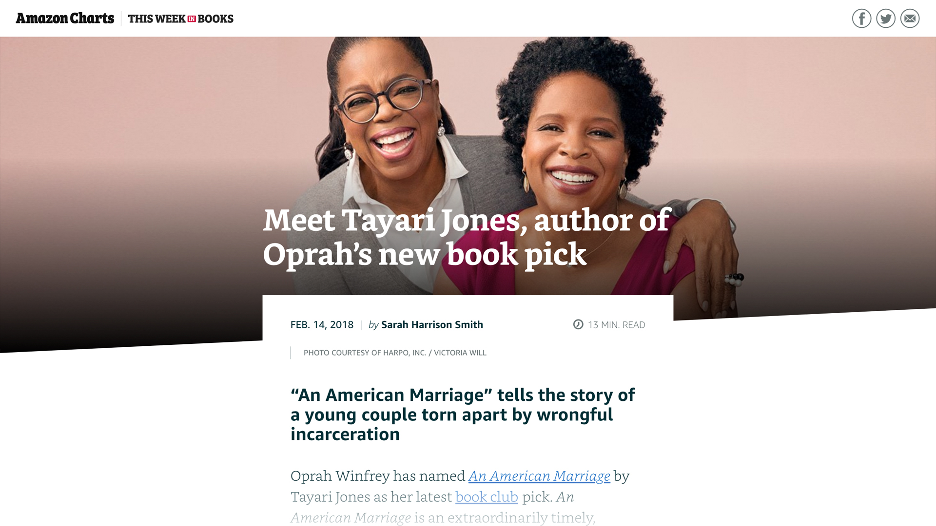
The content for each article can range anywhere from top 10 lists to author interviews, so the treatment for the hero image needed to be able to accommodate photography and illustration.
[Below, L–R: Photographic solution for mobile & social media.]
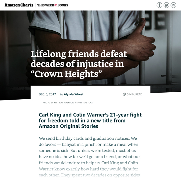
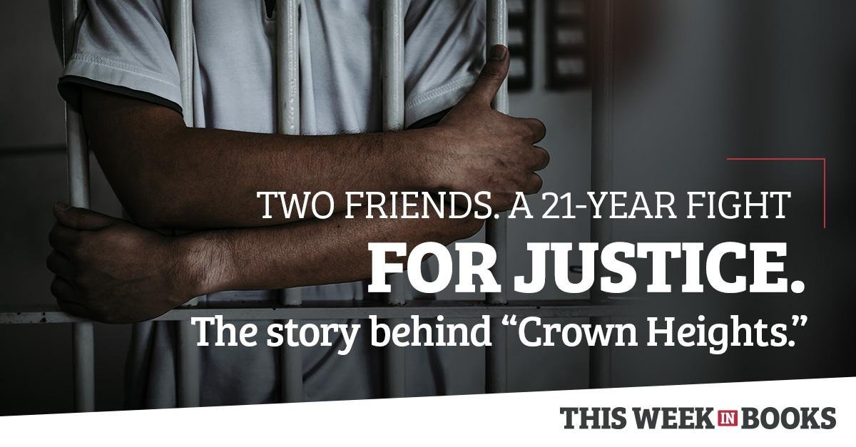
With the title knocking out of the image, there’s an ever-present concern about legibility. Accounting for a variety of screen sizes and uses (such as social media) is also important, as it requires that the image look good and play well with type at multiple cropping points.
[Below, L–R: Photographic solution for mobile & social media.]
The weekly publication, now in its second full year, continues to grow — and the structure we built for it continues to support its evolution with little, if any, change to the design structure.
> View a live issue of This Week in Books.
Experienced with working in agency and studio settings, Amy Redmond is an art director and visual designer who thrives on variety, creating print and interactive work for corporate and non-profit clients. To keep her creativity refreshed, Amy balances digital design with time in her letterpress studio (Amada Press) in Seattle. She teaches typography at the School of Visual Concepts and letterpress printing at Partners in Print, where she also serves as a founding member of PiP’s Leadership Team.