Title: THANKS
Year: 2022
Artist: Amy Redmond
Size: 6 x 8 inches
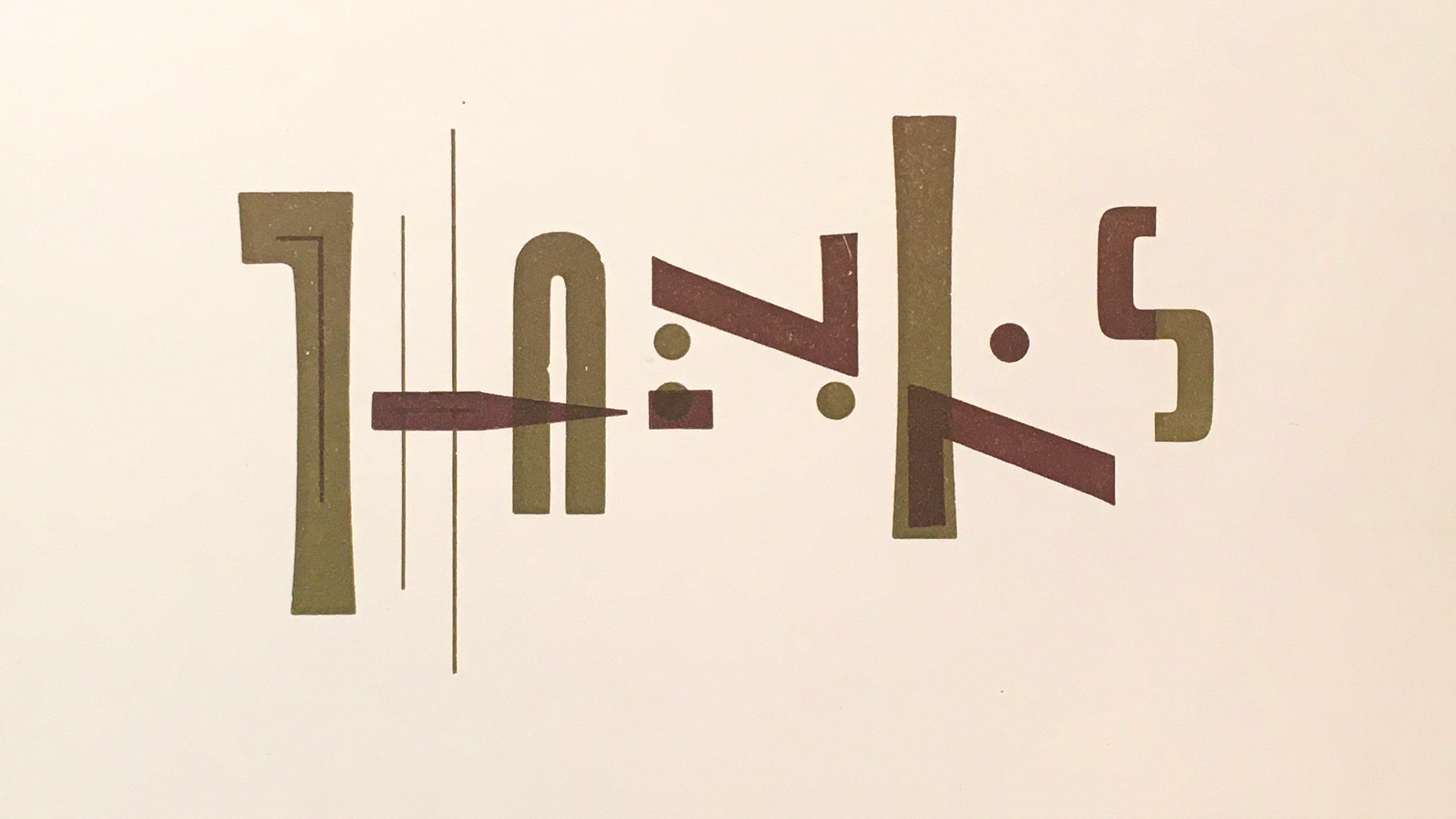
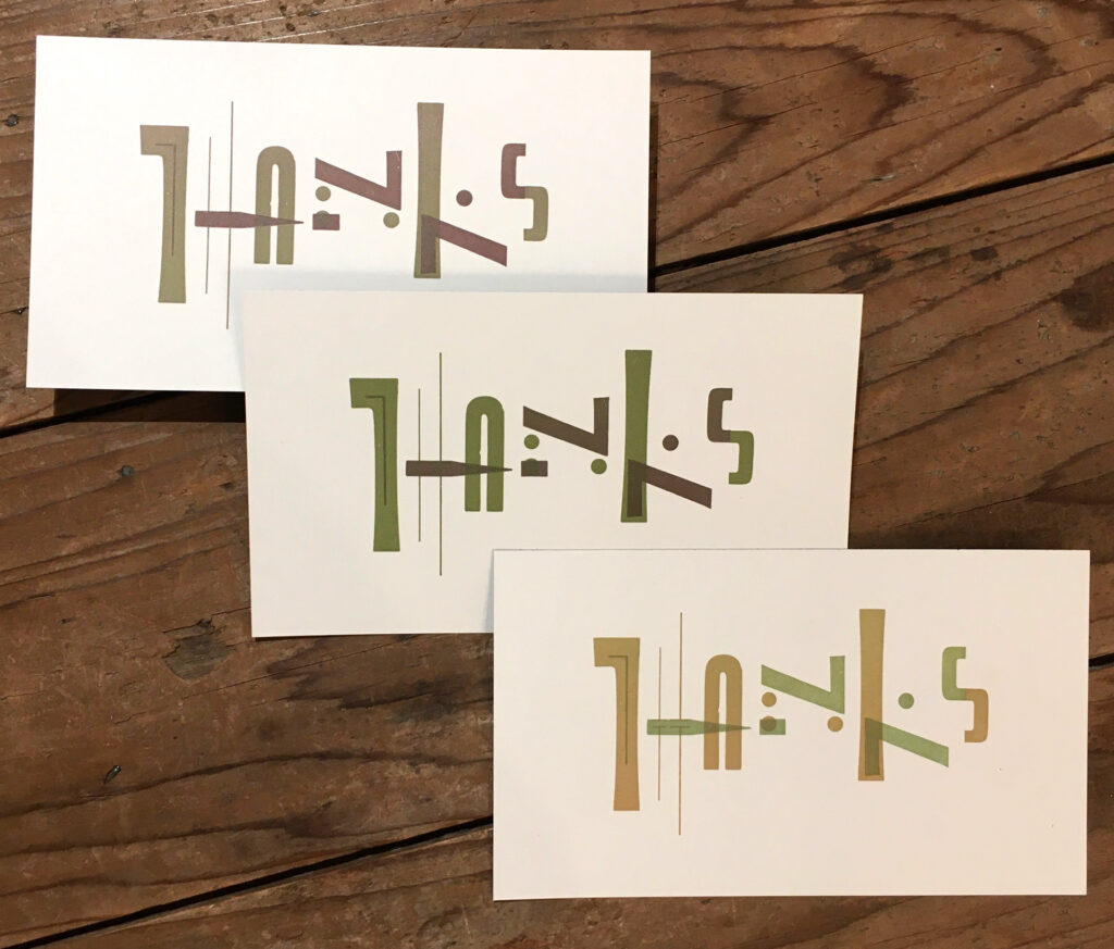
THANKS is a chromatic composition that reimagines glyphs as building blocks for new letterforms. The handset metal type is composed as two separate forms, each void of meaning until one is overprinted upon the other and the message is revealed.
The forms were locked up together in the press bed as a “work & turn” layout, so that once a page went through the press it could immediately be rotated 180 degrees and run through the press again, creating two copies of the same design at once. A split fountain allows for the simultaneous inking of both forms in complementary hues, creating a nuanced chromatic print that emphasizes the underlying structure without sacrificing unity. Once dry, the pages were trimmed in half.
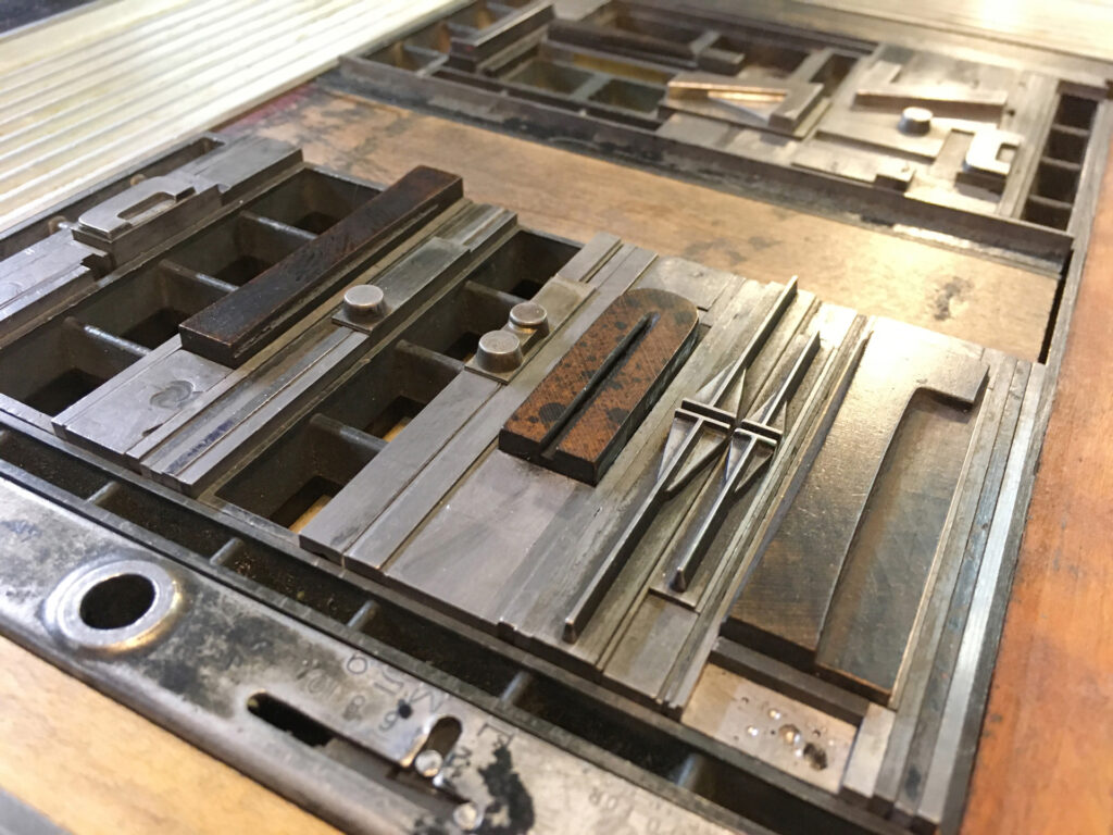
This flat card was letterpress printed in a limited edition using wood and metal type on a 1903 Colt’s Armory platen press. The typefaces used are No. 510, Huxley Vertical, Gothic Condensed, and Bernhard Gothic. In 2023, a folded card version was commissioned by Partners in Print.
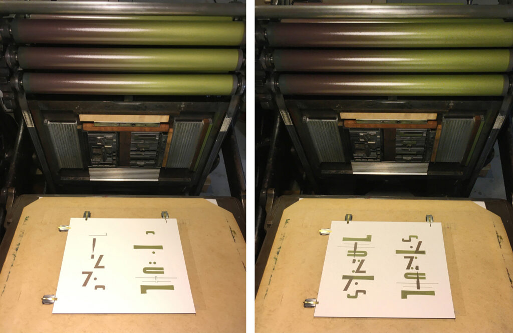
Designed, typeset & letterpress printed by Amy E. Redmond in 2 passes on a Colt’s Armory platen press.
Amada Press is the private letterpress studio of Seattle visual artist and designer Amy Redmond. The main focus of her work is on handset typography using metal and wood type. Amy offers letterpress classes for beginning and advanced students through Partners in Print and teaches typography at the School of Visual Concepts. Her professional design work can be viewed on AmyRedmond.com.
