![]()
Project: SparkThink Branding (2020)
Client: Slalom (Seattle)
Role: Art Director
Slalom is a modern consulting firm focused on strategy, technology, and business transformation. They help companies tackle their most ambitious projects and build new capabilities.
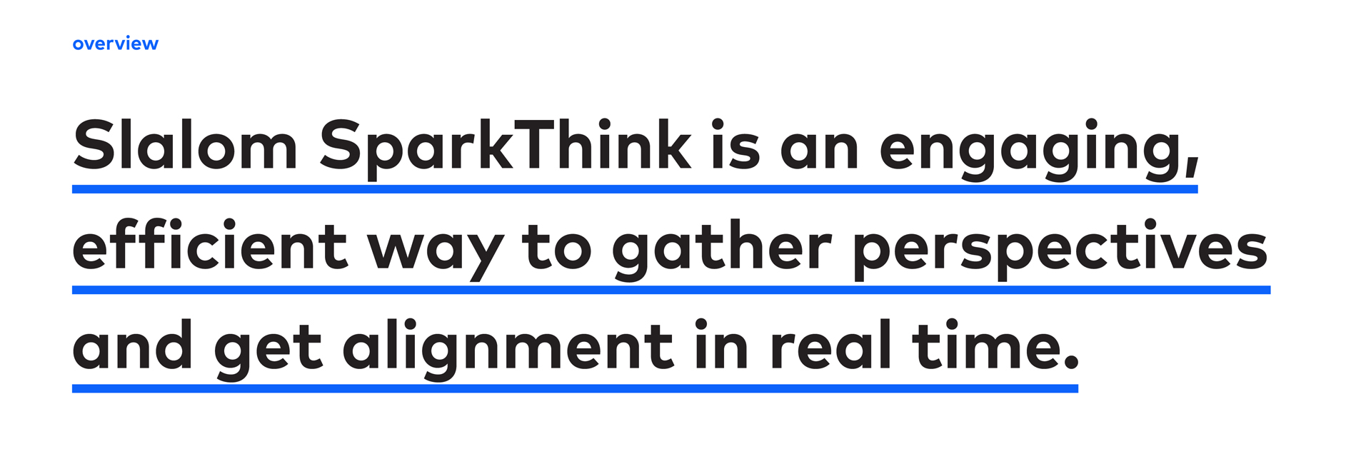
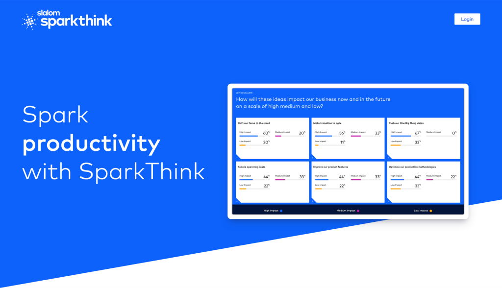
This requires collaboration — and lots of Post-It notes and Sharpie pens. But these tools are clunky when participants are spread across time zones & languages. Slalom solved this problem by building SparkThink: an easy-to-use tool that facilitates workshops, conduct surveys, and moves projects forward — in person or remotely.
The product launched right when it was needed most: in late Spring 2020, as the corona virus precautions shut down businesses and schools. In the 2 months leading up to that, copywriter Dan Goldgeier and I partnered to develop the SparkThink brand, providing Slalom’s product developers with the assets needed to bring the SparkThink app to life.
INTRODUCING A NEW MEMBER TO THE BRAND FAMILY
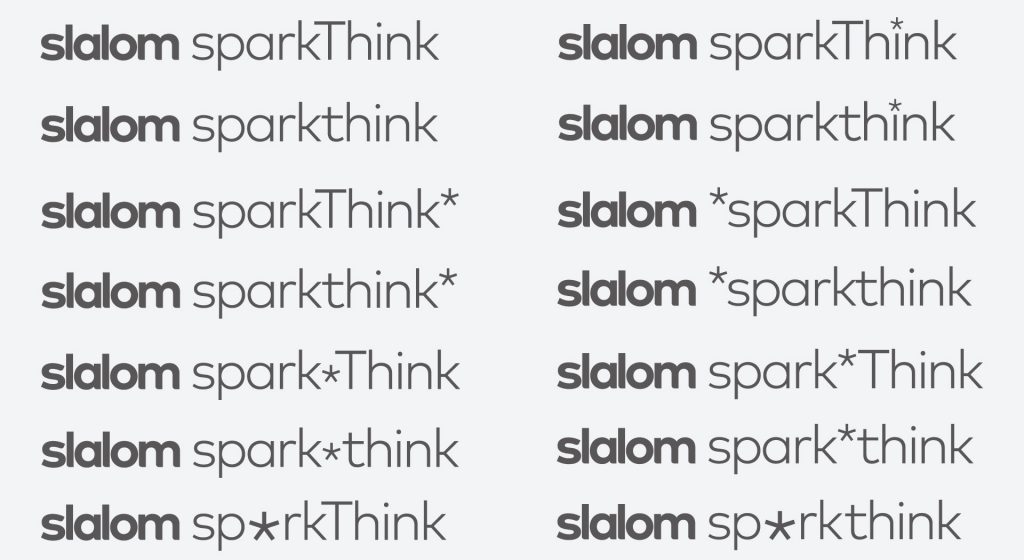
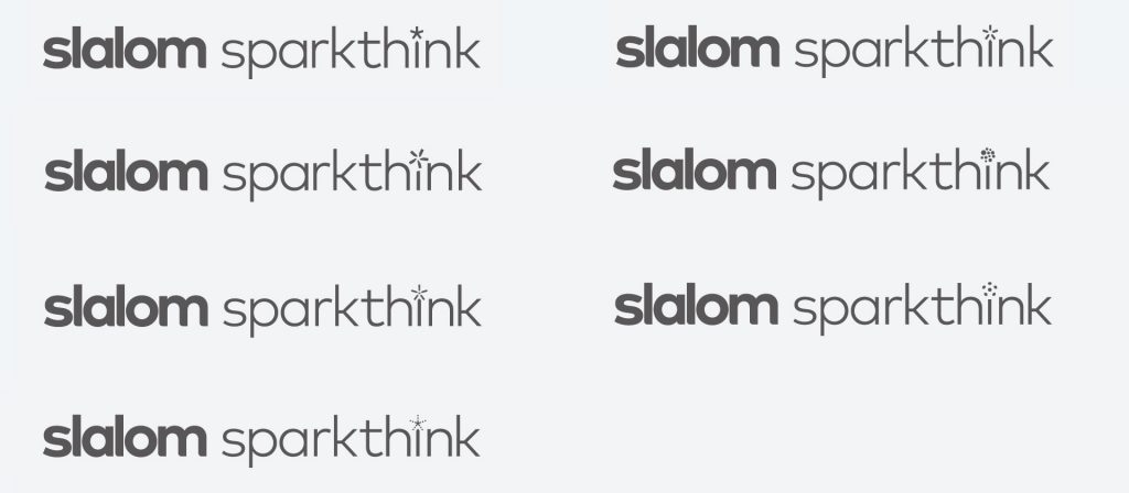
SparkThink needed to have a clear, bold, conversational voice — but remain firmly rooted a subset of the Slalom brand. Using their existing sub-brands as proof for how the parent brand’s rules could flex, I leaned into Slalom’s typography as a starting point for the logotype. An asterisk served as a bridge, introduce conversation about creating a mark to go with the type.
DELIVERING ON THE BRAND PROMISE
SparkThink’s personality is as multi-faceted as the audience it serves: it’s earnest and respectful, casual but serious, and enthusiastic about helping others.
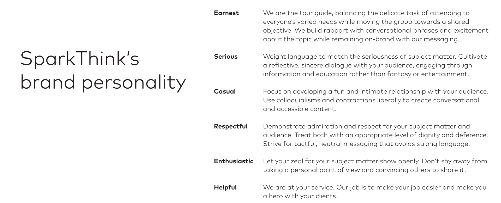
These guided my way as I developed the logo from early sketches to a final solution.
- A cluster of circles, each representing a unique viewpoint, demonstrates the gathering & alignment of perspectives. Their orderly arrangement & increase in size represents growth in consensus as they get closer to the center.

- The spark-shaped arrangement of the circles captures the energy of the pivotal moment when collaborative engagement produces real-time results, galvanizing a group into action.
- The brand’s enthusiasm comes to life through color, underscoring movement towards consensus as it shifts from deep blue on the periphery to bright, warm yellow-orange in the center.
- Earnest, casual: Set in lowercase, the friendly typeface’s curved terminals on the letterforms match the Slalom logo — a clear visual cue that SparkThink is part of the Slalom brand system.
![]()
- Slalom’s status as the “parent company” is retained through color in the two words. The deep blue shade of “sparkthink” lends a serious, respectful tone, emphasizing its relation to Slalom without losing its own identity.
BUILDING OUT THE BRAND
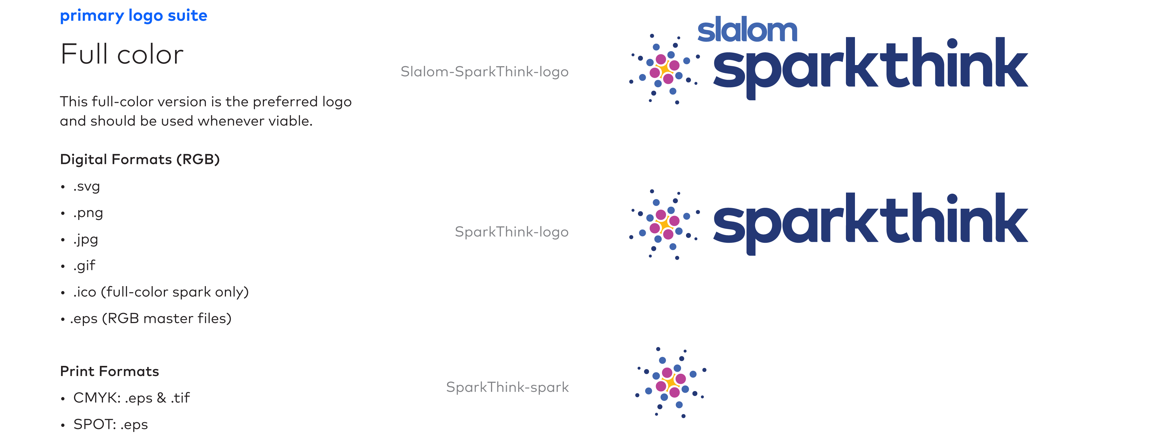
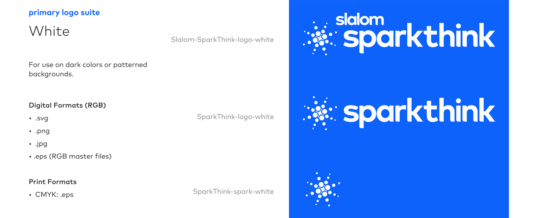
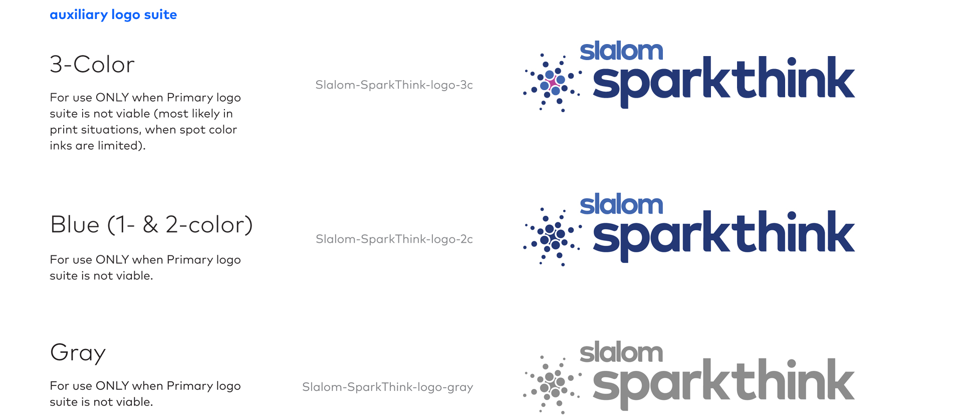
Guidelines arm designers with the tools needed to clearly speak in a brand’s voice. Phase 1 of the guidelines included a summary of all logo file formats, proper logo placement and alignment, color specs, and basic usage examples.
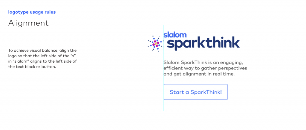
Logo Usage
The logo was built to be flexible in all platforms, large and small. It is used in full color whenever viable, on light backgrounds. It knocks out to white when used on dark colors or patterned backgrounds.
An auxiliary logo suite was built for use in special situations, such as when spot color inks are limited or when embroidered on material.
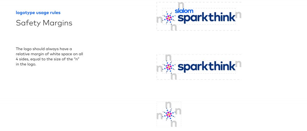
Usage guidelines ensure that the logo always has ample breathing space and is aligned properly with surrounding objects.
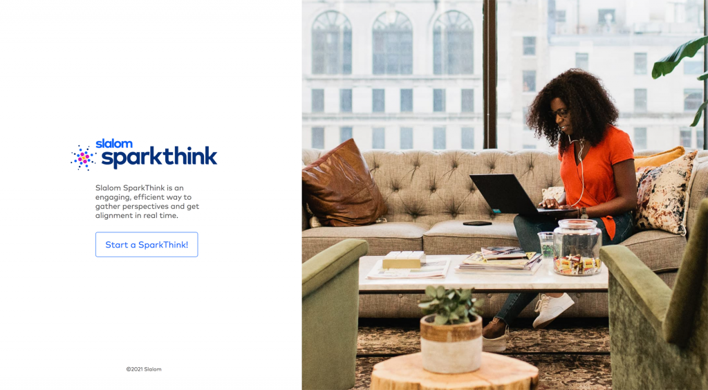
Examples of how the primary logo can be used:
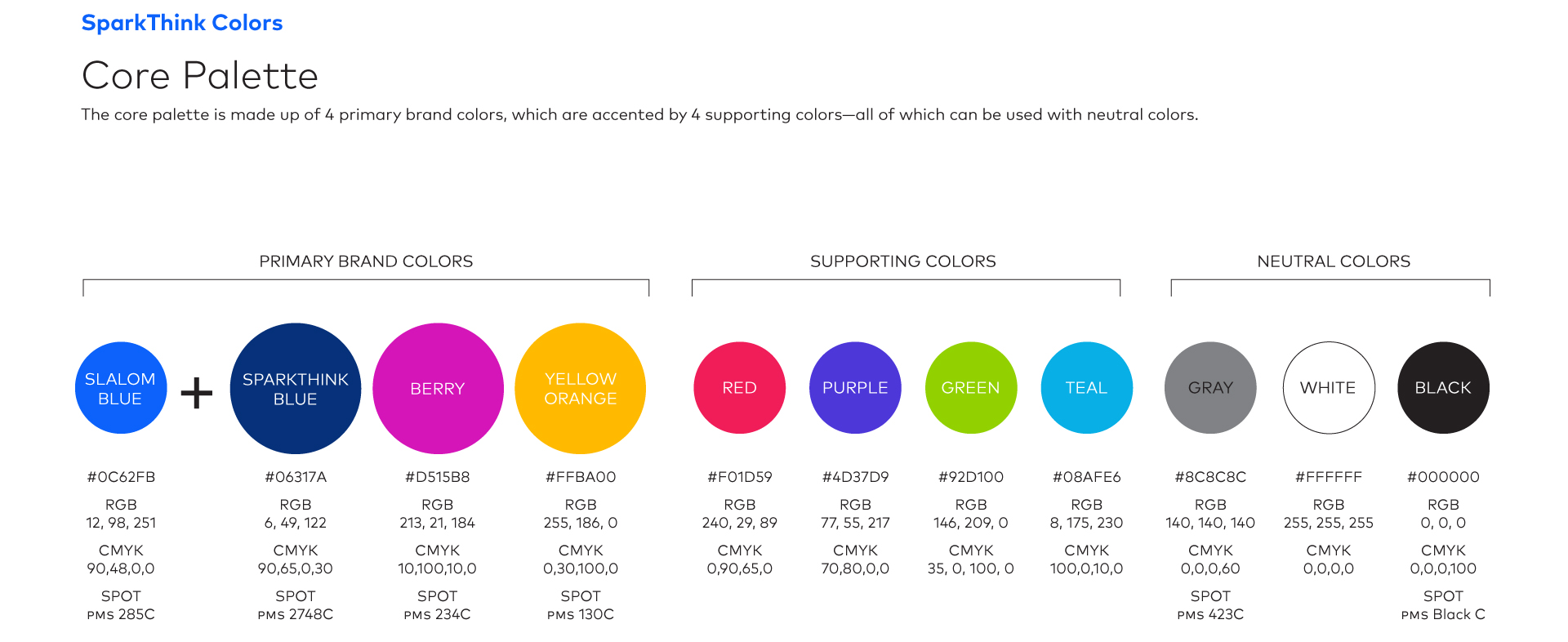
Color Guidelines
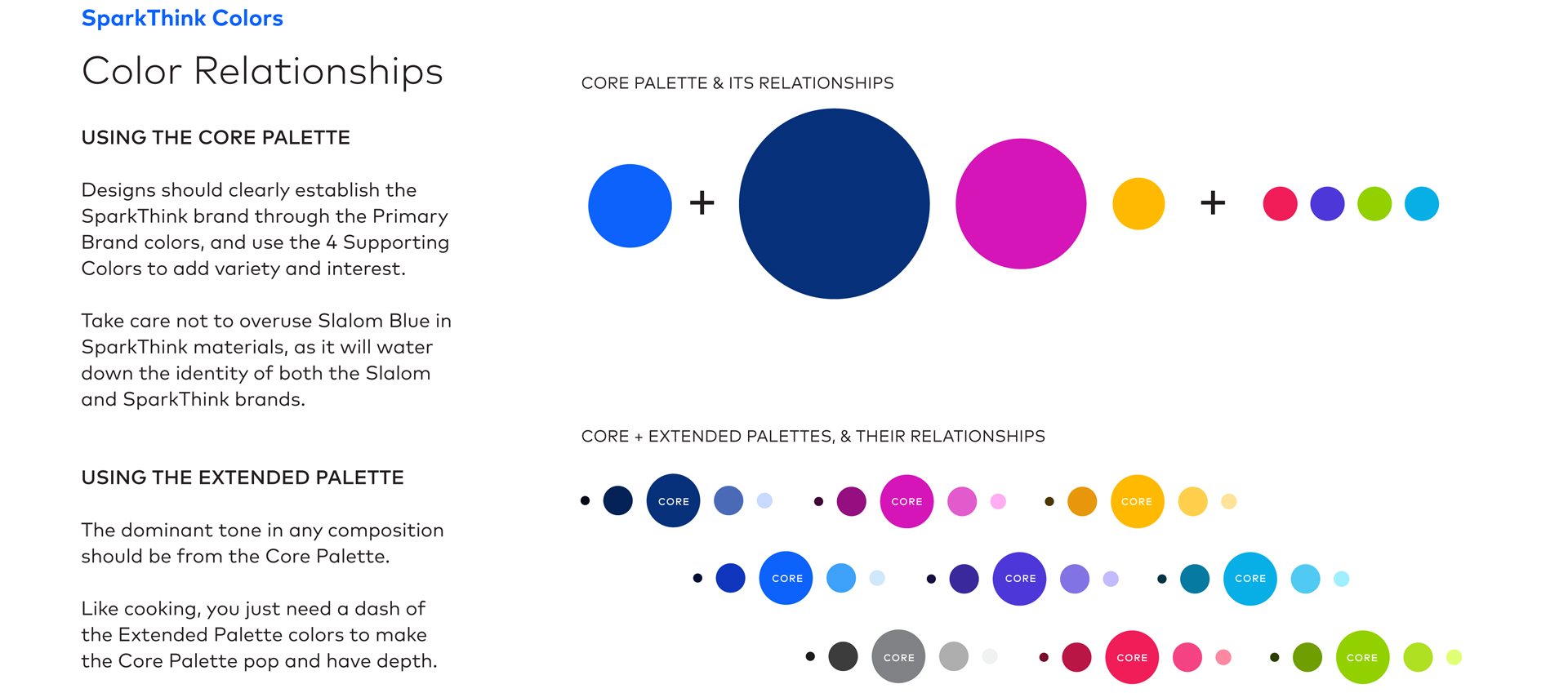
SparkThink’s core color palette was designed to pair with the Slalom brand’s blue. It is made up of 4 primary brand colors and accented by 4 supporting colors—all of which can be used with 3 neutral colors as desired.
An extended color palette was built for use within the application and marketing materials.
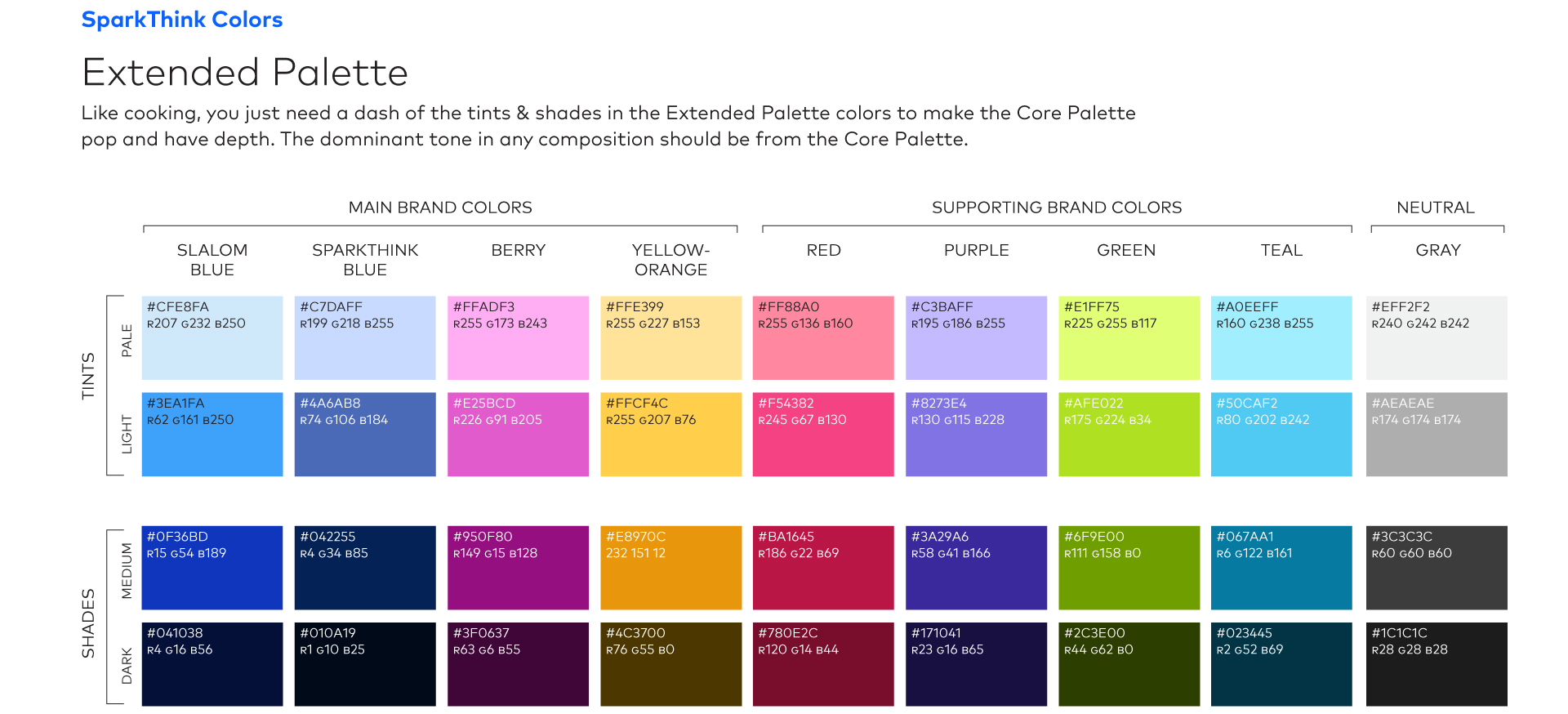
The following diagrams demonstrate the relationship of the core colors to one another. Only a dash of color from the extended palette is needed to make the core palette pop and provide depth.
To see the brand fully come to life in print and digital platforms, view these SparkThink projects.
Experienced with working in agency and studio settings, Amy Redmond is an art director and visual designer who thrives on variety, creating print and interactive work for corporate and non-profit clients. To keep her creativity refreshed, Amy balances digital design with time in her letterpress studio (Amada Press) in Seattle. She teaches typography at the School of Visual Concepts and letterpress printing at Partners in Print, where she also serves as a founding member of PiP’s Leadership Team.