Project: “The Movement” Campaign (Phase 2)
Concept Theme: Reveal Your Power
Client: Oiselle (Seattle)
Role: Art Direction / Design
Oiselle is a Seattle-based “by women, for women” athletic apparel company that has always loved to go fast, take chances, and believes in the transformative power of sport. They make running apparel for female athletes of all ages, paces, and places — and bring together a community of women who love to move, run, and fly. Their mission is threefold: make great product, improve the sport, and build the sisterhood.
The Movement
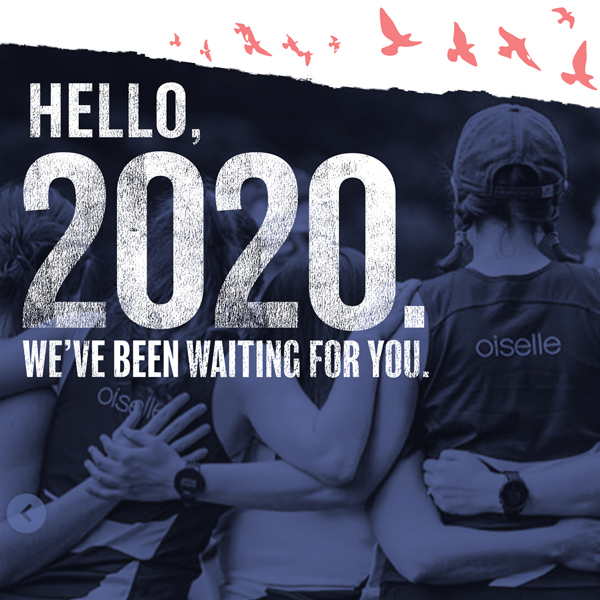
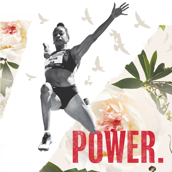
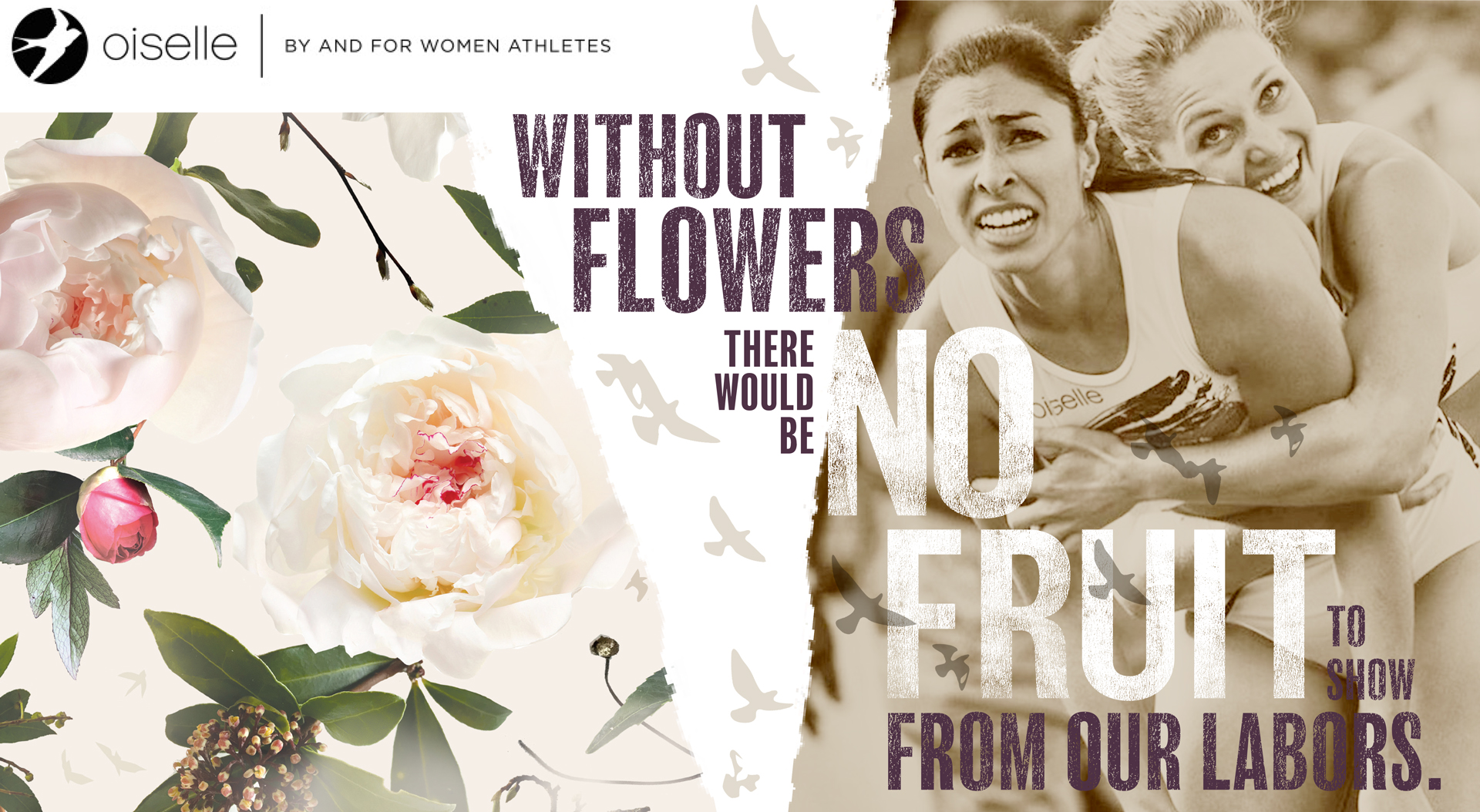
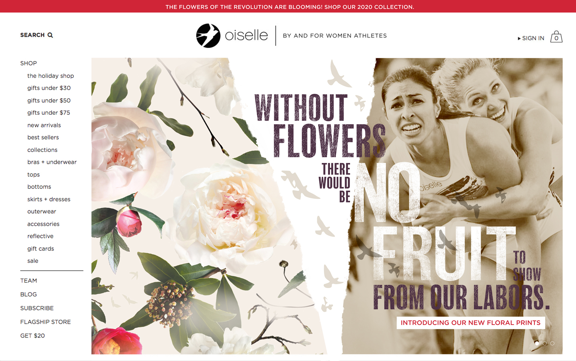
With a presidential election on the horizon, Oiselle (French for “lady bird”) wanted to enter 2020 with a revolutionary spirit of hope and fierce determination, a theme they called The Movement. It would be woven into e-commerce, social media channels, event materials, catalog and retail environments throughout the year.
 The message: We’ve been running this path of gender equity for a long time, but our endurance is tireless and we are tenacious.
The Inspiration
In revolution, the “expected” is torn away, to reveal inner power — letting light in and setting the caged bird free.
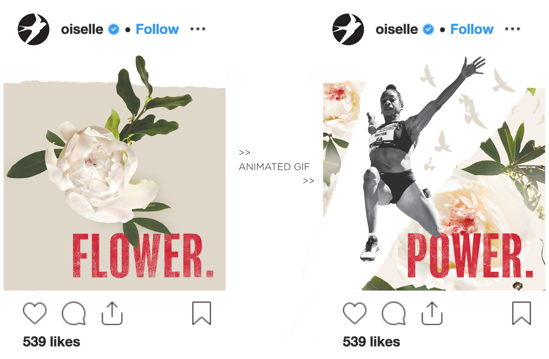
The Look
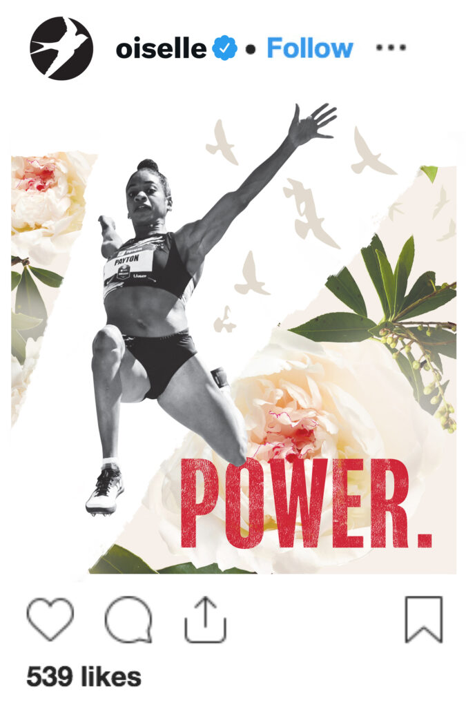
For Phase 2, timed in support of an early Spring launch of running apparel, evolves The Movement’s look and feel from a limited palette to full color, revealing the new fabric patterns that were teased in Phase 1. Birds, flowers, and geometric lines bring grace to raw power.
Photographs of camaraderie and athleticism continue to be the focus, unified through a wash of neutral tones. They’re collaged with Oiselle’s iconic fabric patterns — then torn to reveal inner power. Birds burst forth from the boundaries of the box, rising up as if to say, you can’t hold us back.
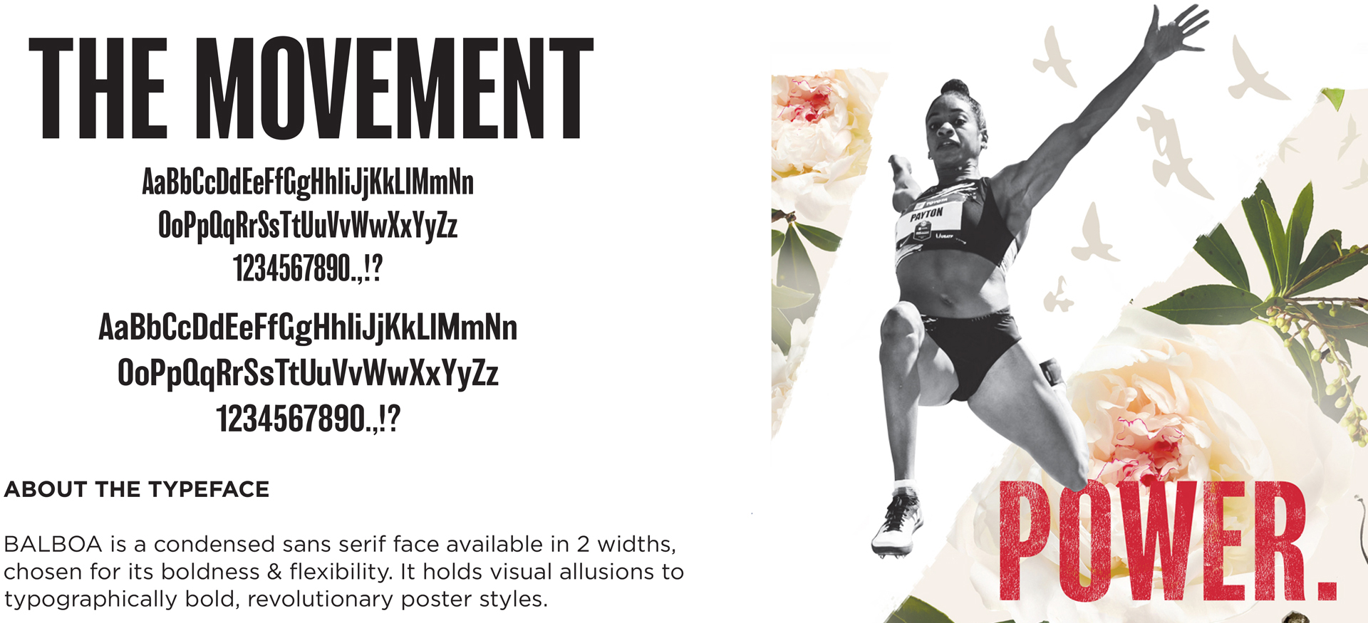
The hand-inked display type (Balboa) introduced in Phase 1 pulls in pops of color from the fabric patterns and contributes energy to the empowered headline messages. Chosen for its boldness and flexibility, the condensed sans serif typeface alludes to bold, social justice posters of the past, pairs well with the brand’s main typefaces (Gotham, Didot), and underscores Oiselle’s grassroots community spirit.
The Movement Grows
Following its Phase 1 introduction in the founder’s annual New Year’s message, The Movement campaign assets that debut on Oiselle’s e-commerce site and social media channels were updated for the Spring Apparel launch, with plans to carry it through in other channels including retail environment, print advertising, direct mail, email marketing campaigns, and event materials.
Experienced with working in agency and studio settings, Amy Redmond is an art director and visual designer who thrives on variety, creating print and interactive work for corporate and non-profit clients. To keep her creativity refreshed, Amy balances digital design with time in her letterpress studio (Amada Press) in Seattle. She teaches typography at the School of Visual Concepts and letterpress printing at Partners in Print, where she also serves as a founding member of PiP’s Leadership Team.