Written by Amy Redmond for Interrobang, published by the Society of Typographic Aficionados (SoTA), 2007. Artwork by C. Christopher Stern.
It was just like one of those clichéd scenes from a sappy romance film: a woman is going about her daily business when her eyes suddenly catch sight of something most desirous and the world around her fades to a blur. The camera follows her as she is drawn towards the object, then shifts focus to reveal the thing that has hypnotized her.
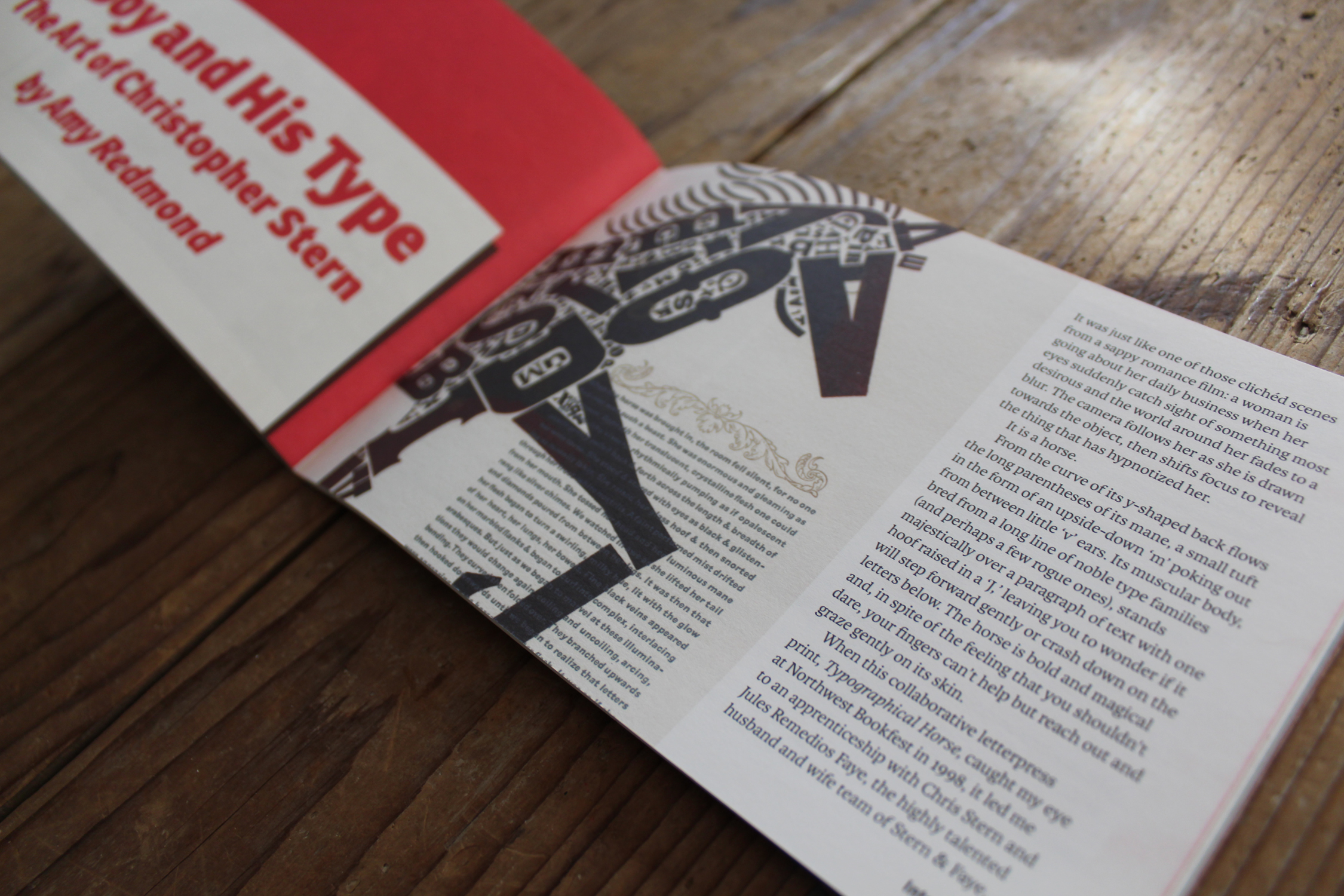
It is a horse.
From the curve of its y-shaped back flows the long parentheses of its mane, a small tuft in the form of an upside-down ‘m’ poking out from between little ‘v’ ears. Its muscular body, bred from a long line of noble type families (and perhaps a few rogue ones), stands majestically over a paragraph of text with one hoof raised in a ‘J, ‘leaving you to wonder if it will step forward gently or crash down on the letters below. The horse is bold and magical and in spite of the feeling that you shouldn’t dare, your fingers can’t help but reach out and graze gently on its skin.
When this collaborative letterpress print, Typographical Horse, caught my eye at Northwest Bookfest in 1998, it led me to an apprenticeship with Chris Stern and Jules Remedios Faye, the highly talented husband and wife team of Stern & Faye, Printers. The print is only a small example of the typographic wonders they created together, but as a wonderful blend of Jules’s storytelling and Chris’s type skills, it remains one of my favorites.
Chris’s background includes a career as a typographer that led him to letterpress, first as a hobby, then as a love that became his life’s work. When he and Jules moved to the Skagit Valley in the early ’90s with their collection of typecasting and letterpress equipment, the printing farm was born. It was about this time last year that I was sitting on their porch, catching up with Chris about his latest printing adventures. Between job work, taking inventory of a friend’s printing equipment, and plans to host a letterpress boot camp, he was as busy as ever.
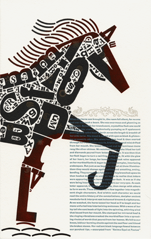
We walked out to the shop to see the new prints he was developing. It’d been awhile since he’d produced any work of his own, and to see them was so stunning it brought tears to my eyes. A few weeks later he completed the edition, titled Minor Blues. In it were the combined strengths of the large format of prints he’d been working on for the past six years: simple, hand-carved imagery, luscious layers of ink color, well-balanced composition, and beautiful, handset type — all working together in a voice that is uniquely his. He was no longer just a typographer with impeccable printing skills; he was an artist. And though he had struggled with the idea, he was finally beginning to accept it.
…
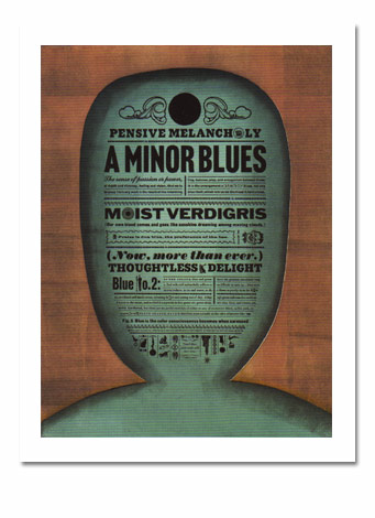
The apple orchard was abundant during the fall that I lived at the printing farm; we ate them in one form or another for just about every meal. The morning of my birthday was no exception. When I walked into the house for breakfast Chris and Jules greeted me with two of my favorite things: a homemade apple pie and a big plate of bacon. They handed me a gift and before removing the brown paper, I knew exactly what it was. Sitting under the glass of a simple black metal frame was my very own copy of Chris’s newest print, Pure Goods, a lush layering of wood type, ornaments and old metal printing plates that were once used to print on cloth bags.
While this piece was not the first in which Chris played with multiple layers of type, image and color, it does mark the beginning of doing so on a grand scale and is what led to many of his other art prints, including Minor Blues. Chris kept an inventory in his head of the type, ornaments, images and printing plates that he, Jules and their friend Scotty had collected over the years, and his large format prints were a playground upon which he could enjoy them to the fullest. “Most everything he did started with type, and image came second,” Jules told me as we sat on the porch steps one recent summer evening. “Pure Goods started with the desire to work with large, wood type and as he was searching for items to create the background, he remembered the Bemis bag plates, which he’d been wanting to use for years. They were the perfect fit for the size in which he was working.”
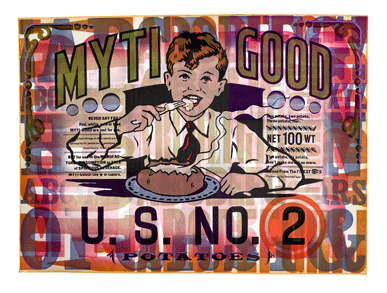
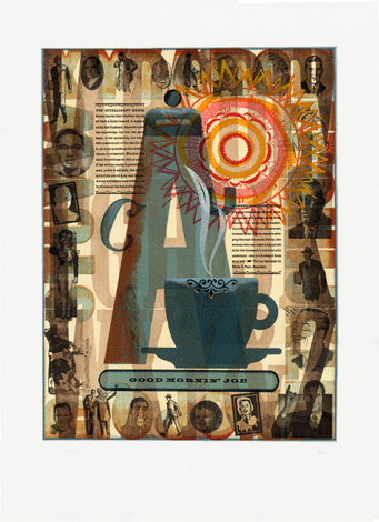
The combination of the bag plates and wood type became the common thread throughout many of Chris’s art prints, and if you look closely at Pure Goods and Think of the Little Ones you can see evidence of those plates hidden behind the layers of type. Peeking out from the center of Pure Goods is a smiling sun framed with the words “sol,” “bleached,” and “flour.” For Think of the Little Ones, Chris chose a plate with a giant globe containing the words “Voluta Flour” to form part of the background. Myti Good showcases a boy eating a baked potato; this is the only print in which Chris gave a bag plate the center spotlight. In later prints such as Good Mornin’ Joe and Welcome Home Honey the plates play smaller supporting roles, and are harder to detect given their lack of obvious identifiers.
No matter what role the bag plates play in these prints, it is clear that the darling of them all is really the wood type. Two alphabets, one large and one small, dominate the background of Pure Goods. The transition to the phrases in the foreground is a subtle one, the words barely visible through the forest of dingbats and ornaments surrounding it. “¡Pure! Goods” it declares in playful punctuation. “Do not wait 4 the wagon. ¡Come see the elephant for yourself!” A train, composed of letterforms, chugs across the bottom of the page, no doubt full of those irresistible pure goods.
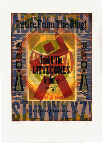
His art prints show how greatly inspired Chris was by the verbiage of the 19th century advertisements his father collected. In Think of the Little Ones he uses the phrases as a playful call to action. A geometric figure carved from linoleum shakes its triangle fist, proclaiming “Retire From The Ring! Think Of The Little Ones At Home. Open Books.” The globe over which the figure stands and the six large letters looming silently behind it suggest that this rally cry has backing. The steady, dedicated march of majuscules securing the border of the print confirms it.
At one point Chris had the words “extra” and “fancy” running along the sides of the print, but then chose to cover them up with layers of decorative ornaments. A closer study reveals why: two of the letters in “extra” had been transposed. Chris would have normally started over from scratch upon finding such an error, but the spirit in which he worked on his art was more open to improvisation on press than the tight work of books. The multi-layered format of the prints allowed him to embrace a style of working that relied upon printing a layer before determining the next; it encouraged him to embrace the imperfections of the process and trust his abilities to shoot more from the hip while on press.
As the prints evolved he improved the relation of foreground to background, allowing the compositions to become more grounded and the text more intricate without losing spontaneity. The method of inking used in Think of the Little Ones and Myti-Good is a noticeable improvement from that of Pure Goods, keeping the prints rich with layers of type without obscuring the central image.
The playful side of Chris’s relationship with words and type revealed itself more with each piece of art he completed. Welcome Home Honey and Good Mornin’ Joe introduce humorous ad cuts, longer blocks of copy, and his talent for using type to create image—all areas in which his wit really shined. As Chris worked he often pulled proofs of the layers on clear mylar and laid them over printed sheets to preview where things would fall on the page. It was a trick that he, Jules, and I used often to humor our needs to maintain control on press while working “spontaneously.” At times, he would have numerous layers taped on top of one another, plotting out his method of attack. A battle plan could change at any moment, but a move was always decisive.
Working in this method became a necessity as he indulged in greater amounts of copy, such as Welcome Home Honey. Gone are the full alphabets of type; in their place remains one single letter (‘B’) layered in various typefaces to form a frame. Down each side of the print runs a long column of text in what can only be described as either a type aficionado’s dream or a type distributor’s nightmare. Set with immense detail, it is a cornucopia of type peppered with dingbats and includes a small ad for “the printing office of Stern and Faye” offering “All types letterpress: Fine or Fancy, Plain or Common, Ordinary or Extra-ordinary!” It gives the print the feeling that it was once part of an almanac or newspaper from long ago.
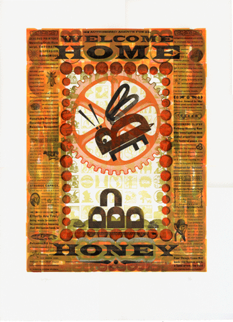
As charming as the text is, the true highlight of Welcome Home Honey is by far the buzzing bee in the center of the page, composed purely of type. Its B-shaped body hovers in the air by the grace of two wings made from the letter ‘Q’, its exclamation-mark-antennae equally surprised by the miracle of flight. Its legs are formed from a condensed ‘E,’ and the v-point of its stinger reminds you that all charms aside, a bee is still a bee.
The central image of Good Mornin’ Joe, also created from type, is a large A-shaped coffee pot with a decorative ‘c’ for a handle. Its contents are kept under wraps by a ‘D’ turned on its side, but the aromatic scent promised by the copy still escapes from the U-curve of the spout in a colorful burst of concentric circles. An appeal to the stereotypical 1940s-era wife who prides herself on not only being a housekeeper, but also a “husband keeper” is so over-the-top that it is clearly being used in jest, and one only needs to look at the equally comical images of men in the print to confirm Chris’s intent. Two little ‘o’s give one pompous man a pair of cartoon glasses; another’s head is printed over the body of a woman; and in the lower left there is simply an animal where you’d expect to see a man. As one last poke at the viewer, and as a nod to his love of coffee, Chris “signed” the print with the moniker “Stern & Faye, Roasters.”
…
Fall came quickly in 2006, and not long after Minor Blues was completed Chris was diagnosed with colon cancer at age 56. He passed away a month later, and his loss was felt deeply in the design, type, book arts and letterpress communities. It seems fitting that a person with such abundant enthusiasm, knowledge, and talent for all things type-related passed away on the 26th day of the month – the same number of letters in the alphabet.
One only needs to see his work to appreciate Chris’s evolution from typographer, designer, typecaster and printer to the culminating role of an artist. I invite you to visit the exhibit TypeCon is hosting in honor of Chris and the work he produced over the past 20 years, both on his own and with Jules. In it you will see the wide scope of Chris’s typographic talents, from the meticulous detail of his formal work to the playful side of his personal art.
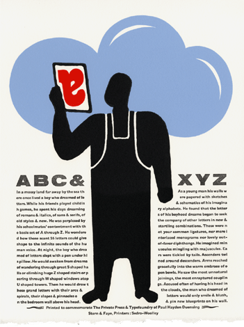
Of the two ends of the spectrum it was the art side that he seemed to struggle with most, and it was through his large format artwork that I saw the most growth during the time that we were friends. Though these prints are what I feel embody Chris most as a person, it is the text of a smaller print that he and Jules created for friend and fellow printer/typecaster Paul Duensing that sums him up best. The story in ABC & XYZ tells of a boy who “spent his days dreaming of romans & italics, of sans & serifs, of old styles & new.” At night, when the boy dreams of U-shaped buildings, I imagine it is Chris, not the boy, peering down from the w-shaped windows, high in the sans serif sky.
Amy Redmond is a Seattle-area graphic designer and letterpress printer who has been mixing up letterpress concoctions since 1998, when her job as a book designer turned into a quest to learn the finer points of typography. A four-year letterpress apprenticeship with Stern & Faye, Printers, developed into a friendship to which she credits most of her type knowledge and love.
The work of Chris Stern and Jules Remedios Faye, his partner in life and art, can be seen on SternAndFaye.com, where some limited edition letterpress prints and other art pieces are still available for purchase. A retrospective of Chris’s work, for which this article was written, was exhibited in the SoTA TypeGallery during TypeCon2007 in Seattle, WA.
The artwork is presented in this article courtesy of Stern & Faye Printers, copyright C. Christopher Stern & Jules Remedios Faye.