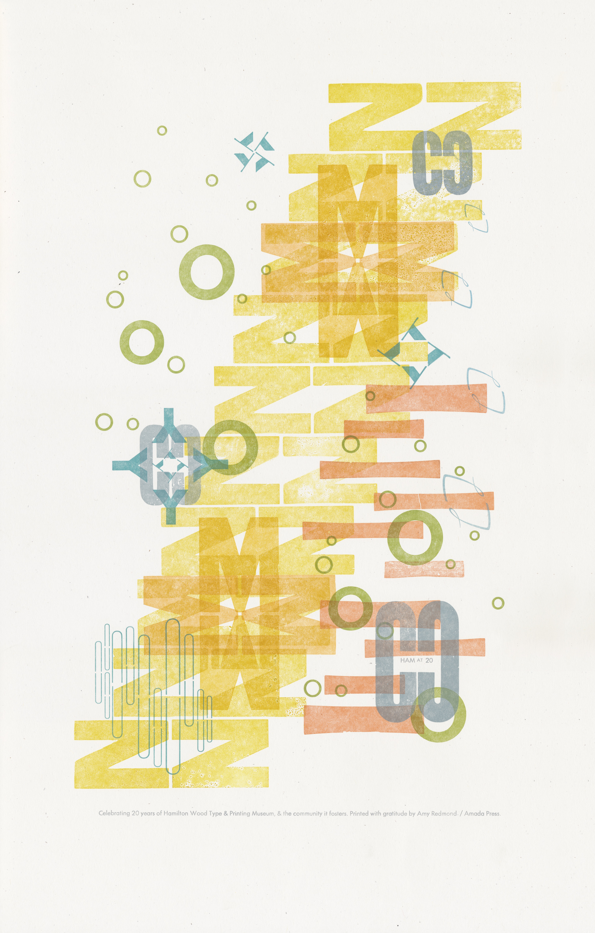
Title: Community (HAM at 20)
Year: 2019
Artist: Amy Redmond
Size: 12.5 x 19 inches
About HAM at 20
Ham at 20 is a collaborative poster project celebrating the twentieth anniversary of The Hamilton Wood Type & Printing Museum in Two Rivers, Wisconsin. For each month of 2019, new posters are released for sale via Hamilton’s website shop in an edition of 50; 25 are reserved for year-end portfolios that include all prints. The posters are created by a roster of accomplished letterpress printers and promising up-and-comers starting in the field.
ABOUT MY PRINT
For the past year I’ve been playing with wood and metal type as a means to create abstract imagery, enjoying the exploration of letters and numbers as shapes. The early series of prints were a collage of random characters, but recent editions center around a single word. For this edition, celebrating Hamilton Wood Type & Printing Museum’s 20th anniversary, I chose “community.”
The way I develop prints in these series is a departure from my familiar, premeditated process. I design on the fly and migrate the ink color as each pass comes off the press, an exercise in the catharsis of being fully present in the moment. The letters of the word are not printed sequentially, nor are they meant to be read.
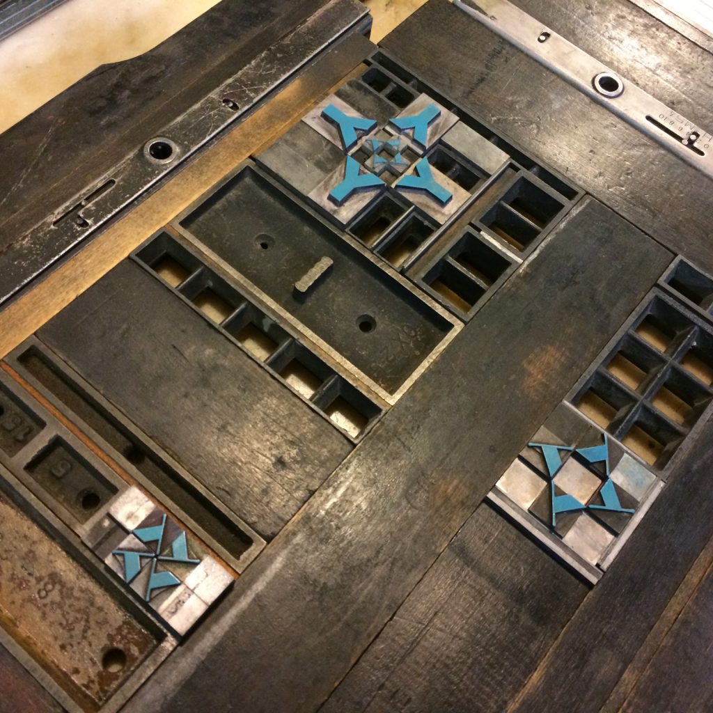
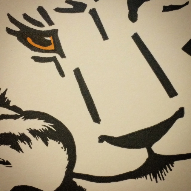
Work of this scale is stressful, as there’s always the risk of ruining it. But it also offers unexpected delight — such as how the capital C’s, when arranged to face one another, form the outlined shape of an “H” (for Hamilton, of course). The result of this admittedly inefficient process is not just a print; it’s a visual transcript, from conception to completion, of time well-spent playing on press.
At 12.5×19” this poster is the largest sheet I’ve run on my Colt’s Armory Platen Press. Right out of the gate I maxed out the 13×19” chase trying to print twenty 12-pica N’s, but I was still able to squeeze in the grippers.
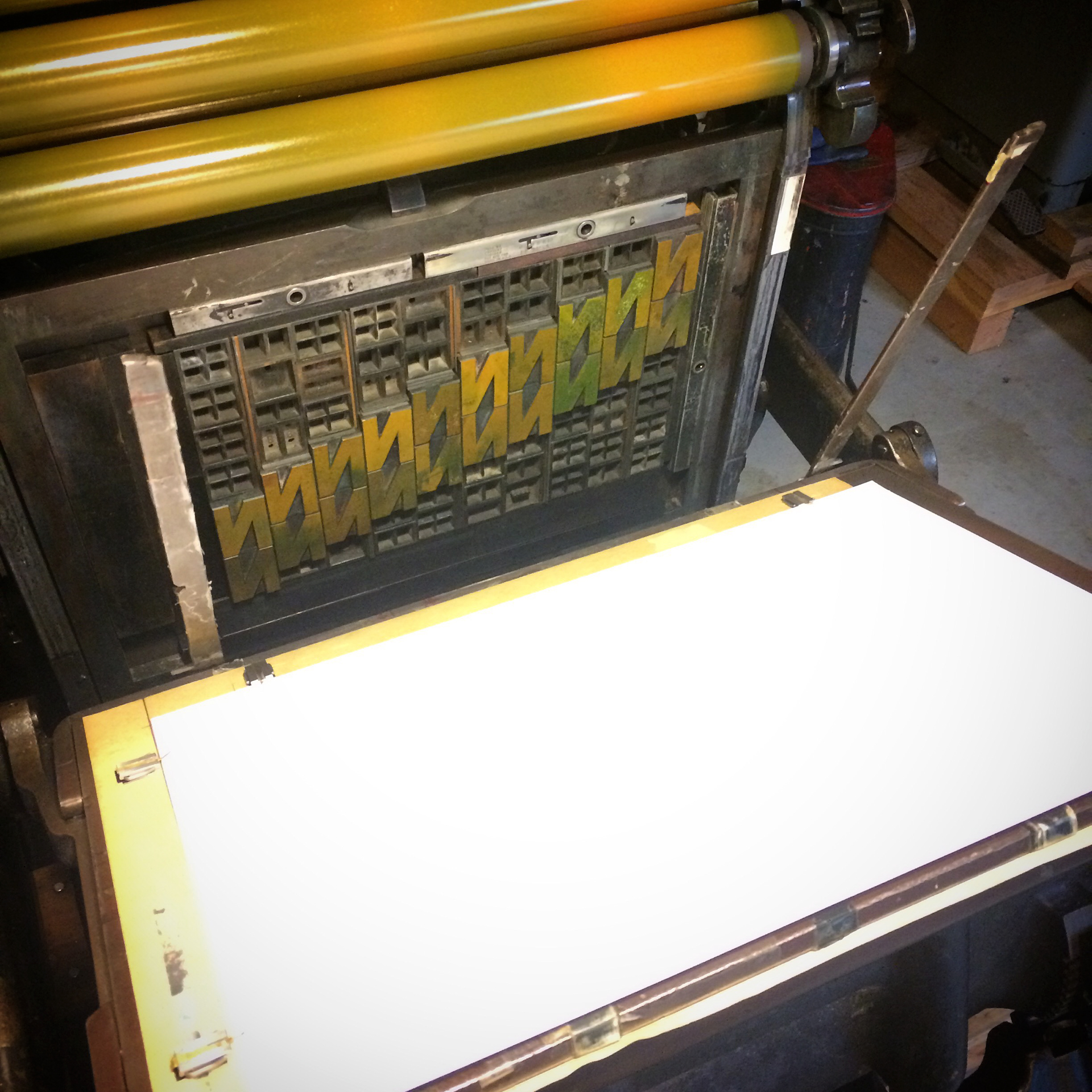
However I had to do away with roller bearers for the entire edition, and the smaller the type got the more it felt like working without a net, a feeling completely inline with the “Look Ma, no hands!” spirit of the entire process. I had no choice but to sit back and enjoy the ride.
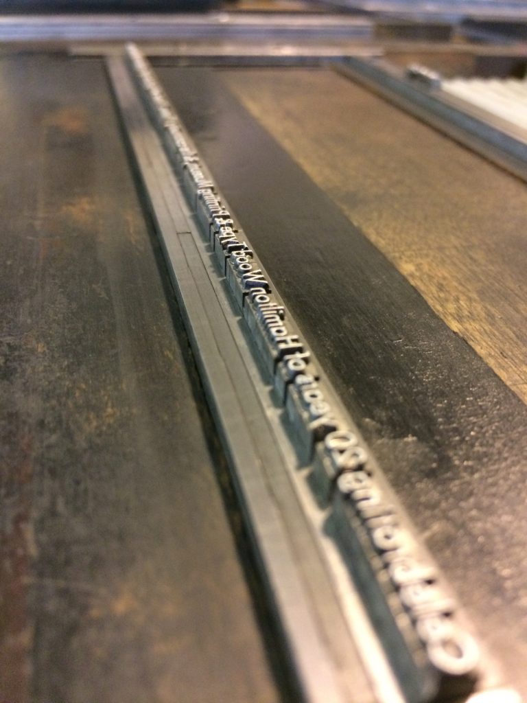
Here are the typefaces I used, in the order they were printed:
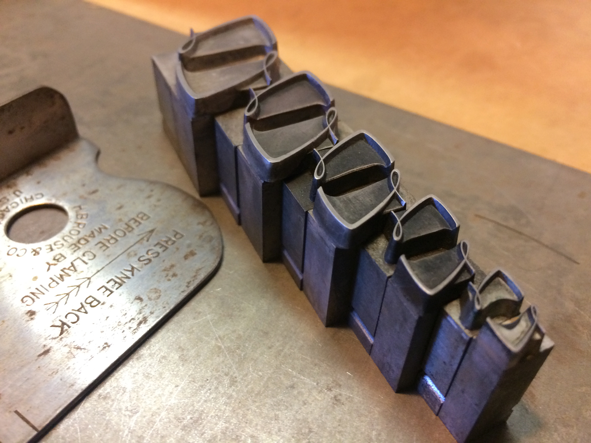
- N = Gothic Sans (wood)
- M = Gothic Sans (wood)
- M= Gothic Sans (wood)
- I = Number 510, Number 510 Condensed (wood)
- O = Berhnard Gothic Medium (metal)
- Y = Spartan Black, Broadway (metal)
- U = Huxley Vertical (metal)
- T = Trafton Script (metal)
- C = Gothic Sans (Condensed)
- Colophon & “HAM AT 20″ = Spartan Book (metal)
What Hamilton Means to Me
Like many others, “community” is the word that comes to mind when I think of HWT. My first trip to Two Rivers was for the 2011 Wayzgoose, with a group of printers from the School of Visual Concepts in Seattle. Upon arriving in Milwaukee we excitedly piled into a mini van and pointed it north towards “the letterpress motherland,” stopping only to gather provisions (we’d heard rumors our vegetarians wouldn’t fare so well in 2R otherwise).
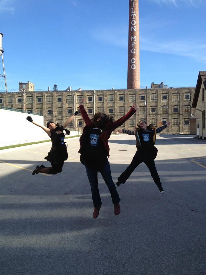
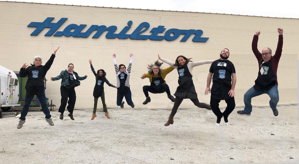
We bonded over wood type and presses, exploring the dark dusty corners of the old factory, and perfecting the perfect group “jump shot” in front of the Hamilton chimney stacks. (An annual tradition now continued below the blue sign outside of the Museum.)
That inaugural trip strengthened my relationship with my local community, and every HWT Wayzgoose since then has expanded it to include printers from around the world. While the Museum’s type, presses, and sharing of knowledge continue to motivate me to make the journey to Wisconsin each fall, it is the promise of spending time with printers from the dark dusty corners of the globe that excites me most. I’m not alone when I say that the Museum is a special place, home to letterpress family reunions and guardian of treasured heirlooms. May it stay inky and print fond memories for many generations to come.
—
“Community (HAM AT 20)” was designed & letterpress printed by Amy Redmond on French Starch White 80 lb. cover (generously donated by French Paper Company) in an edition of 50, using a Colt’s Armory platen press.
Amada Press is the private letterpress studio of Seattle visual artist and designer Amy Redmond. The main focus of her work is on handset typography using metal and wood type. Amy offers letterpress classes for beginning and advanced students through Partners in Print and teaches typography at the School of Visual Concepts. Her professional design work can be viewed on AmyRedmond.com.